The Lub d layout system is inspired by South East Asian Street signage. The layout system has been created to ensure we’re making maximal use of space in all layouts, while creating a bold and impactful look for our brand.
Layout Categories
The new Lub d brand has a flexible layout system, that can adapt to the needs of different formats and creative executions. There are three different layout styles which we use within our brand.
Shape Stack layout
There are two different variations of the burst shape; a rounded version and a rectangle version. These two shapes are interchangeable, and should never be used at the same time.
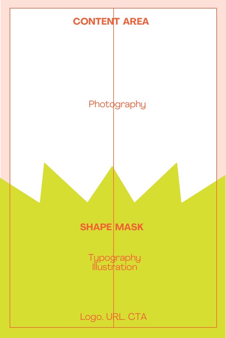
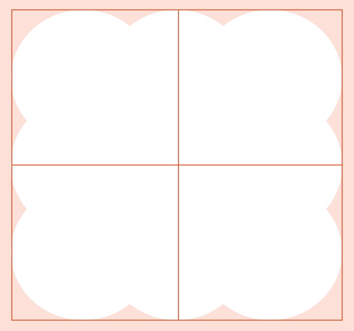
Shape Mask Layout
A shape mask is when the background and the graphic shape combine to create a layout content area.
Shape container layout
The shape container is when typography and content sit inside a graphic shape.
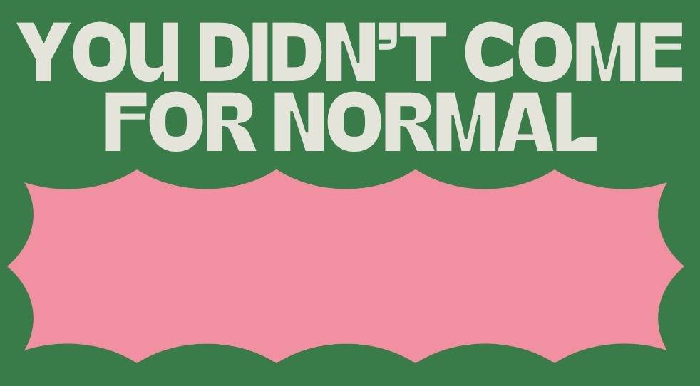
Stacked Shape Layout
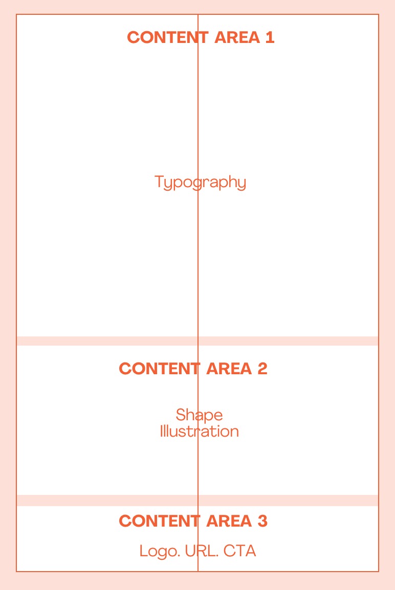
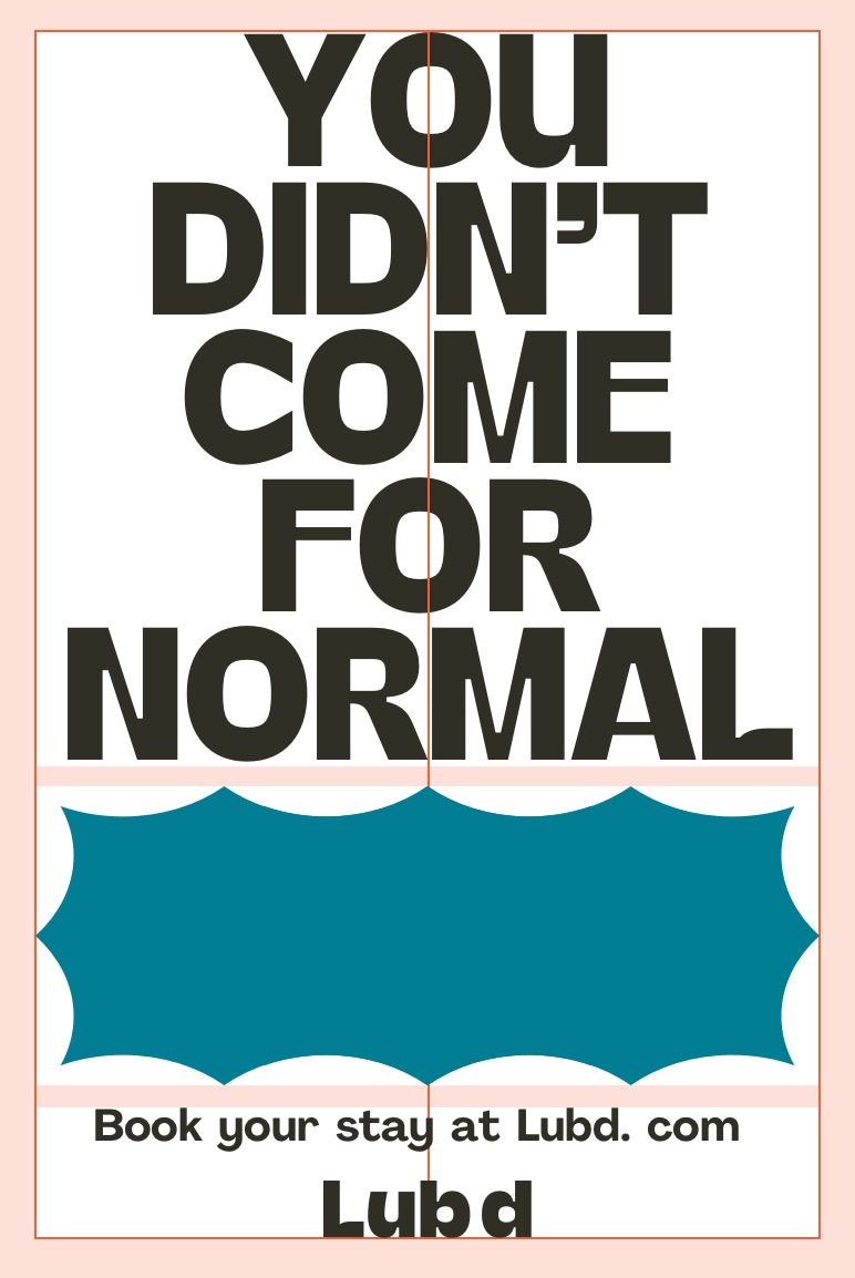
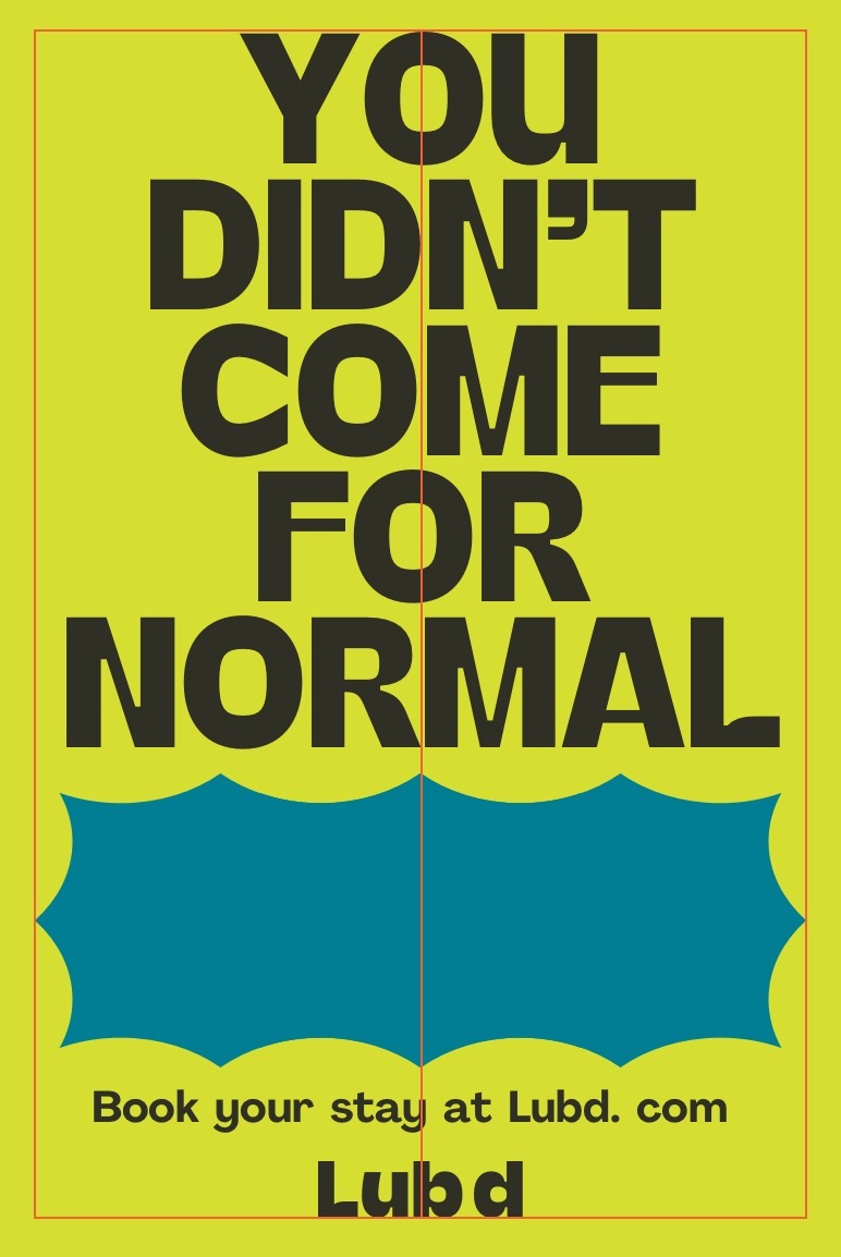
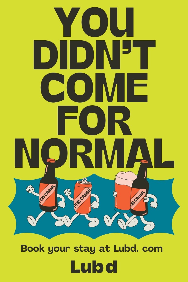
The stacked shape layout is our primary layout and should be used as much as possible. This layout is best for large typographic headlines that are used alongside shapes, illustration or photography.
PORTRAIT LAYOUT
For portrait executions, we place typography above our graphic shapes.
USAGE
- EVENT POSTERS
- SOCIAL POSTS
- MERCHANDISE
- PORTRAIT BILLBOARDS
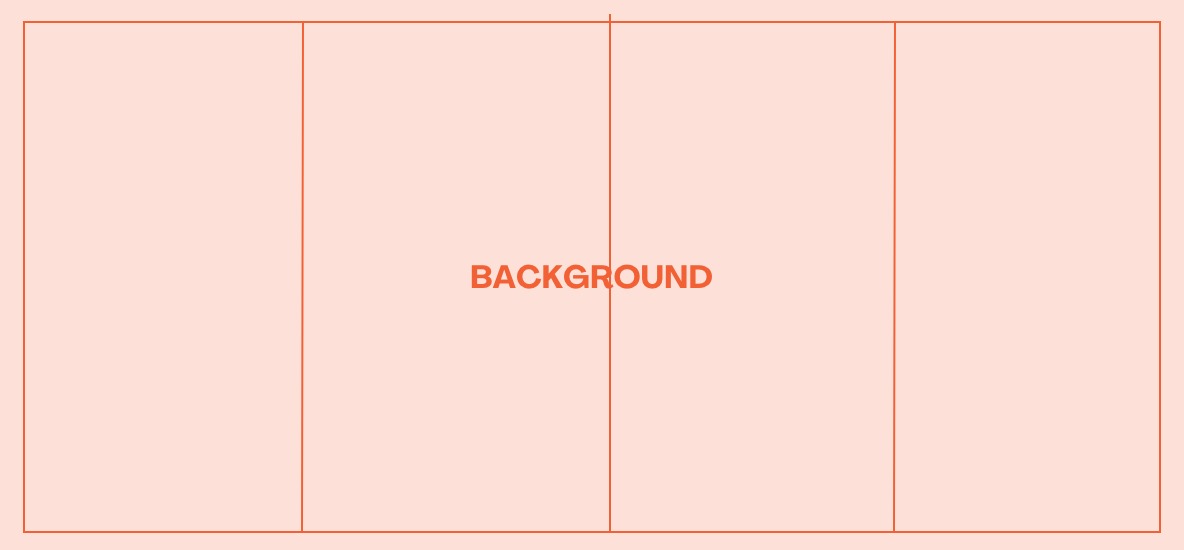
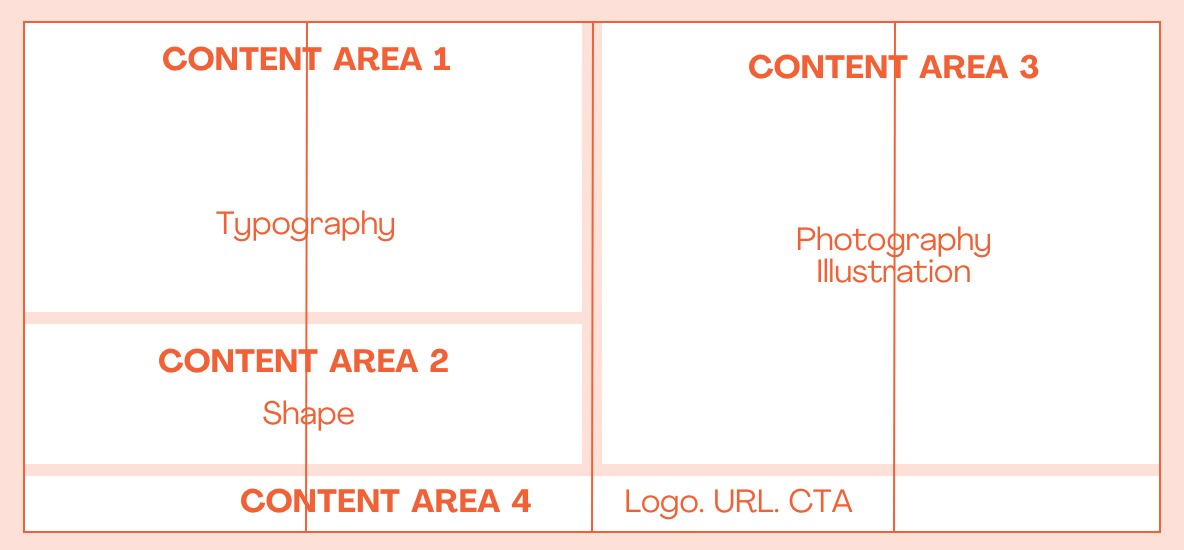
Set the margins of your document with a centred vertical column
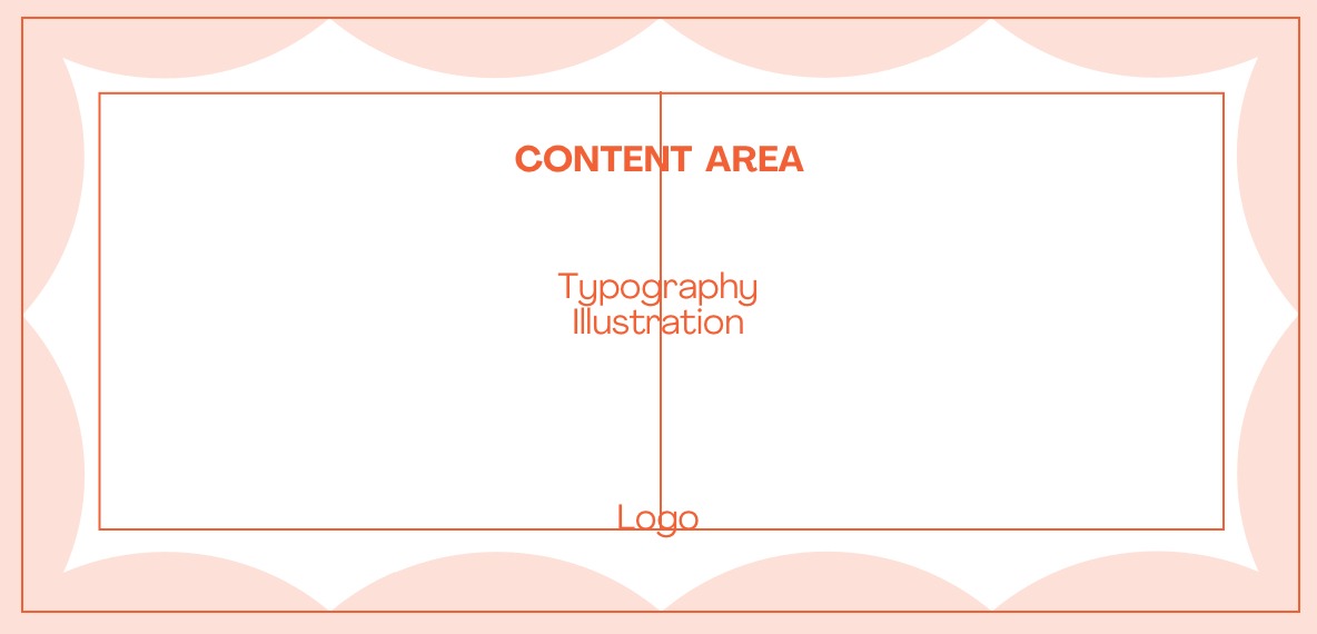
Content areas dictate the hierarchy of elements. Where typography uses approx. 60% of the layout’s visual space
Set the typography to the margins of layout. Adjust content areas 2 + 3 to accomodate The size of the typography or shape
Apply colouring and ensure the centre alignment of all visual elements
The finished layout. typography only
The finished layout. typography and illustration
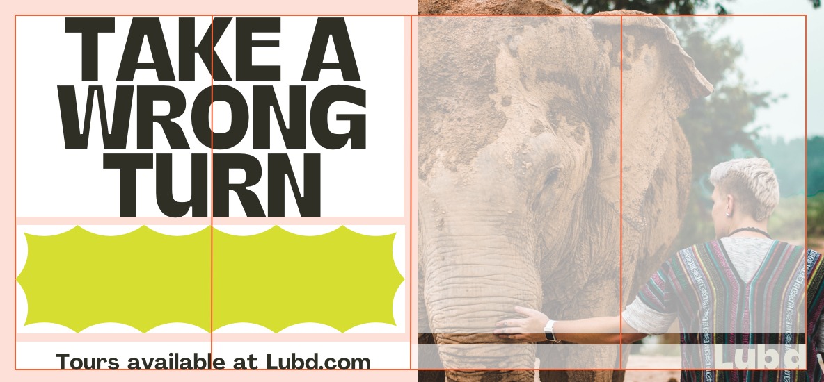
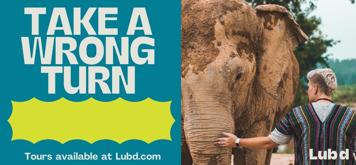
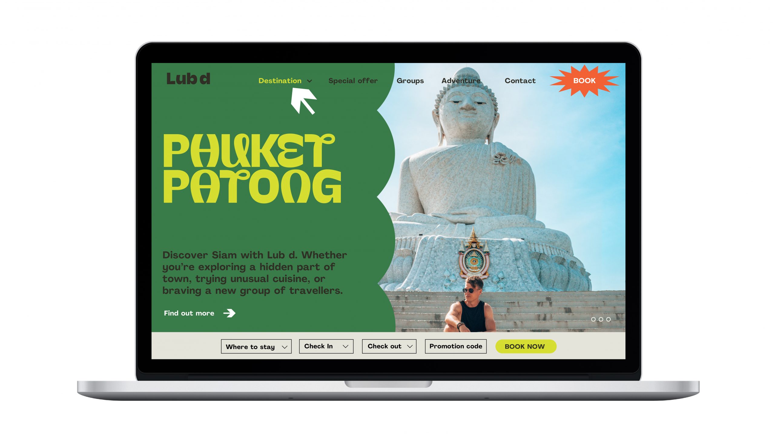
LANDSCAPE LAYOUT
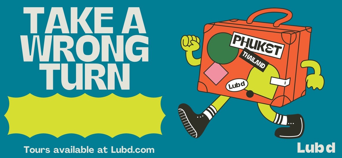
For landscape executions, the stacked layout system separates illustration or photography from text and shape which ensures the best use of the space.
USAGE
- LANDSCAPE BILLBOARDS
- WEB BANNERS
- WEBSITE MODULES
- PRESENTATION TEMPLATES
Set margins to application format. Divide format using a four column grid
Using the same guidance as the portrait layout with our content areas. We add an additional content area for photography or illustration
When placing in our visual elements, we allow photography to extend to edges of our format
Logo. URL and CTA;s may sit centred with the other elements or align to the side of margin.
The finished layout
When adding illustration it is best to use the same background colour across the whole format.
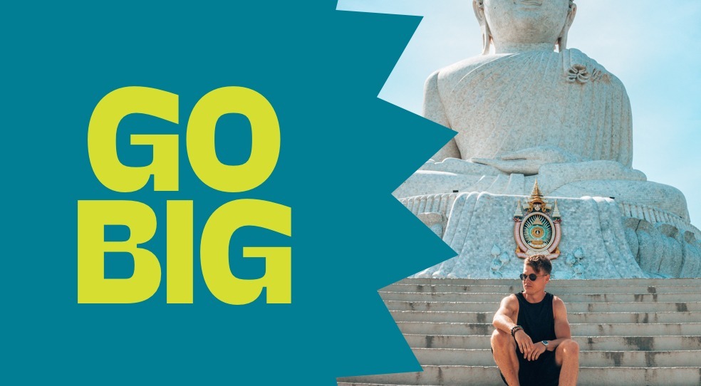
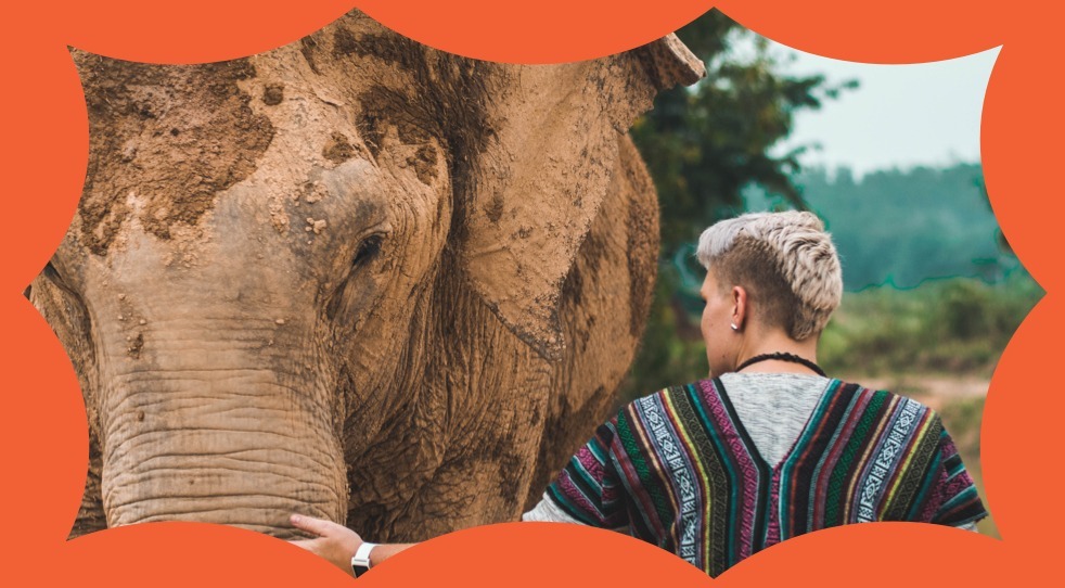
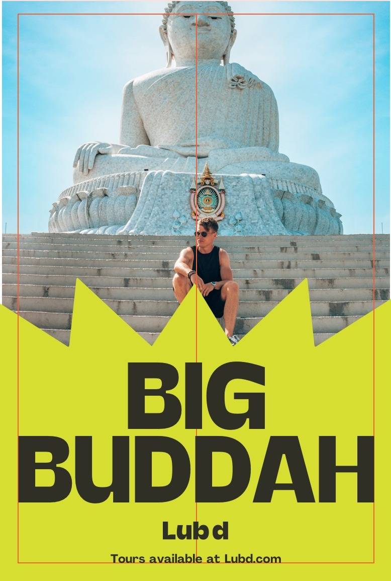
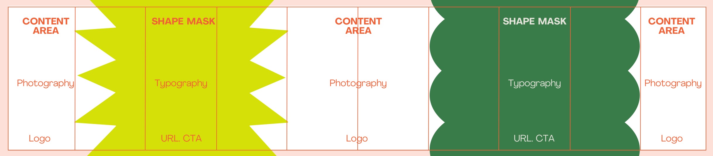
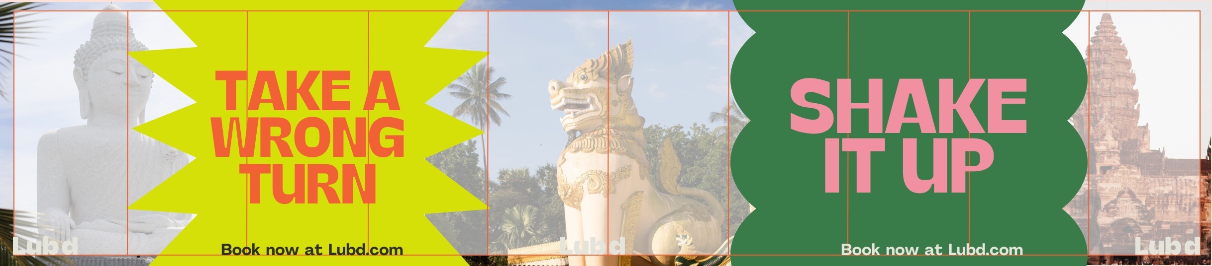
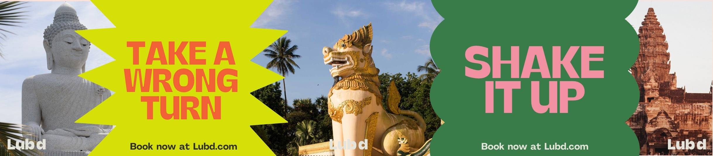
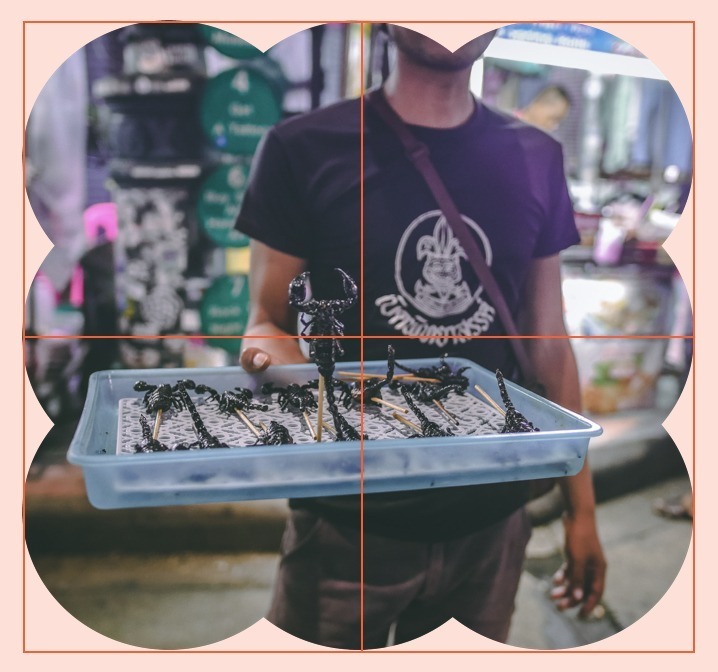
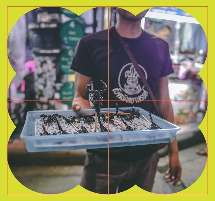
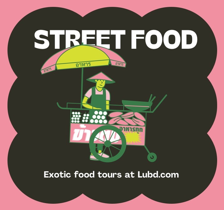
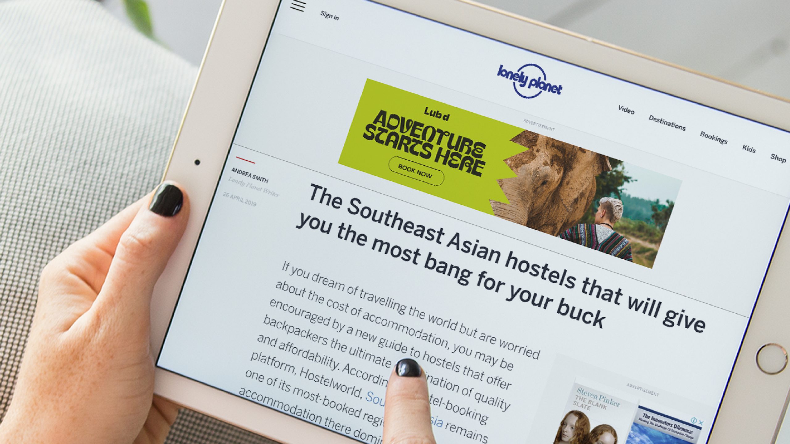
Shape Mask
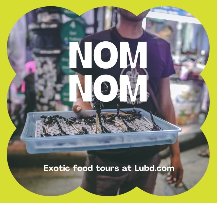
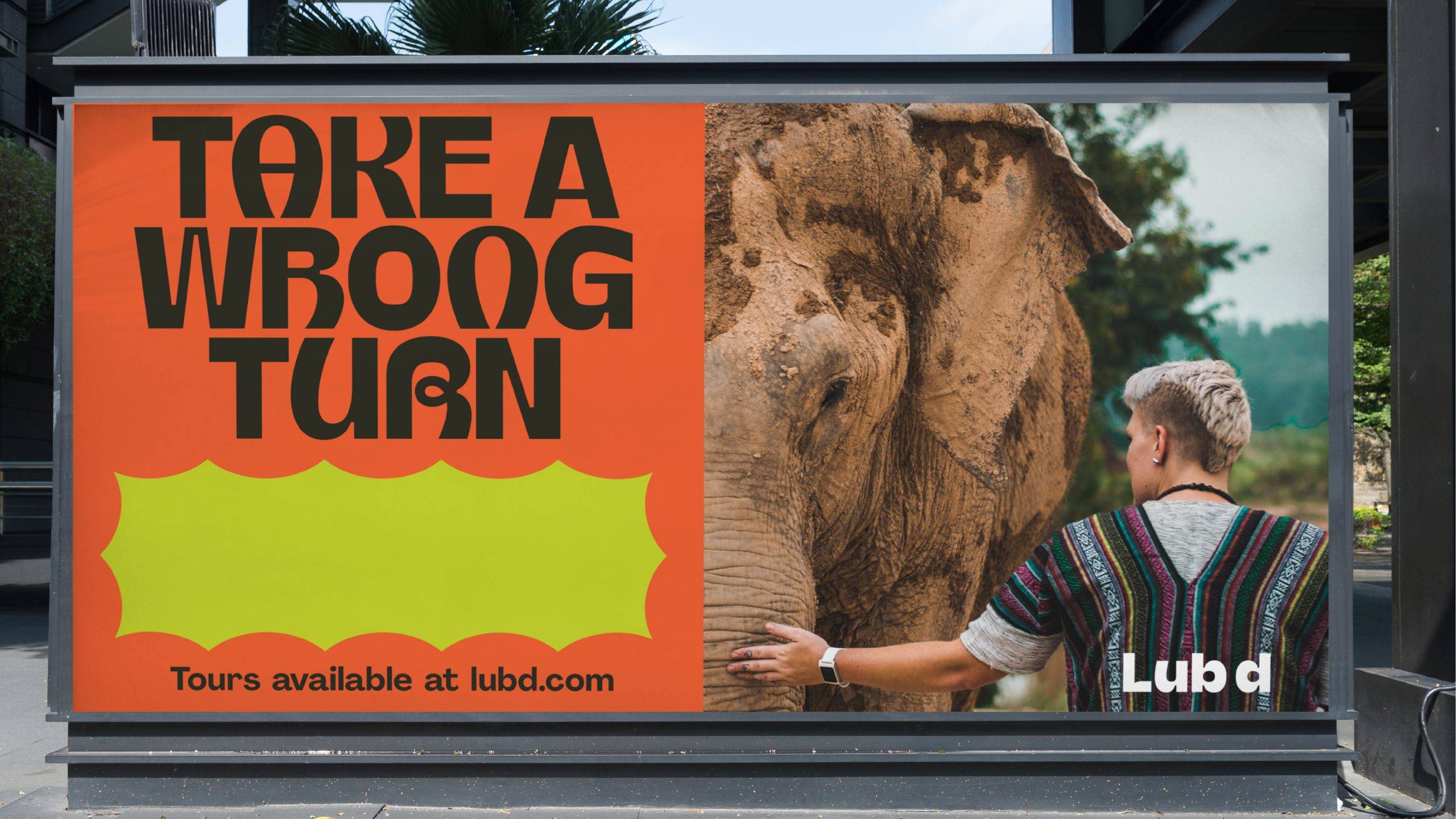
The shape mask layout should be used do draw attention to photography. This treatment allows us to own our photographic content by including our distinct brand shapes.
ONE SIDED SHAPE MASK
The one sided shape mask can be used vertically and horizontally. Primarily it is used to create space for text when using photography.
USAGE
- EVENT POSTERS
- SOCIAL POSTS
- PORTRAIT & LANDSCAPE BILLBOARDS
- WEBSITE
Set the margins of your document with a centred vertical column
Place shape mask over your background and content area
The shape mask over laps photography. Typographic content and Logo / CTA sit contained inside the shape mask
Final layout with photography. This layout may also be applied horizontally.
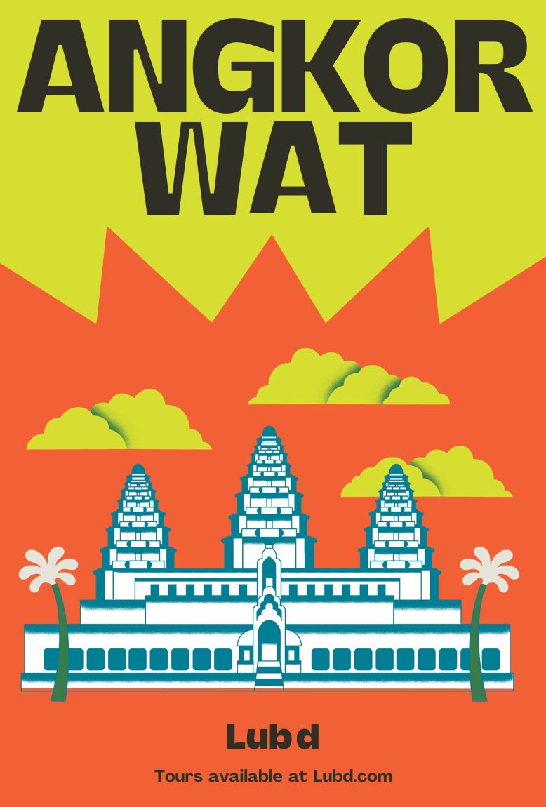
Illustration should sit inside the shape mask. Typography can be place on the background content layer. We never use photography and illustration together
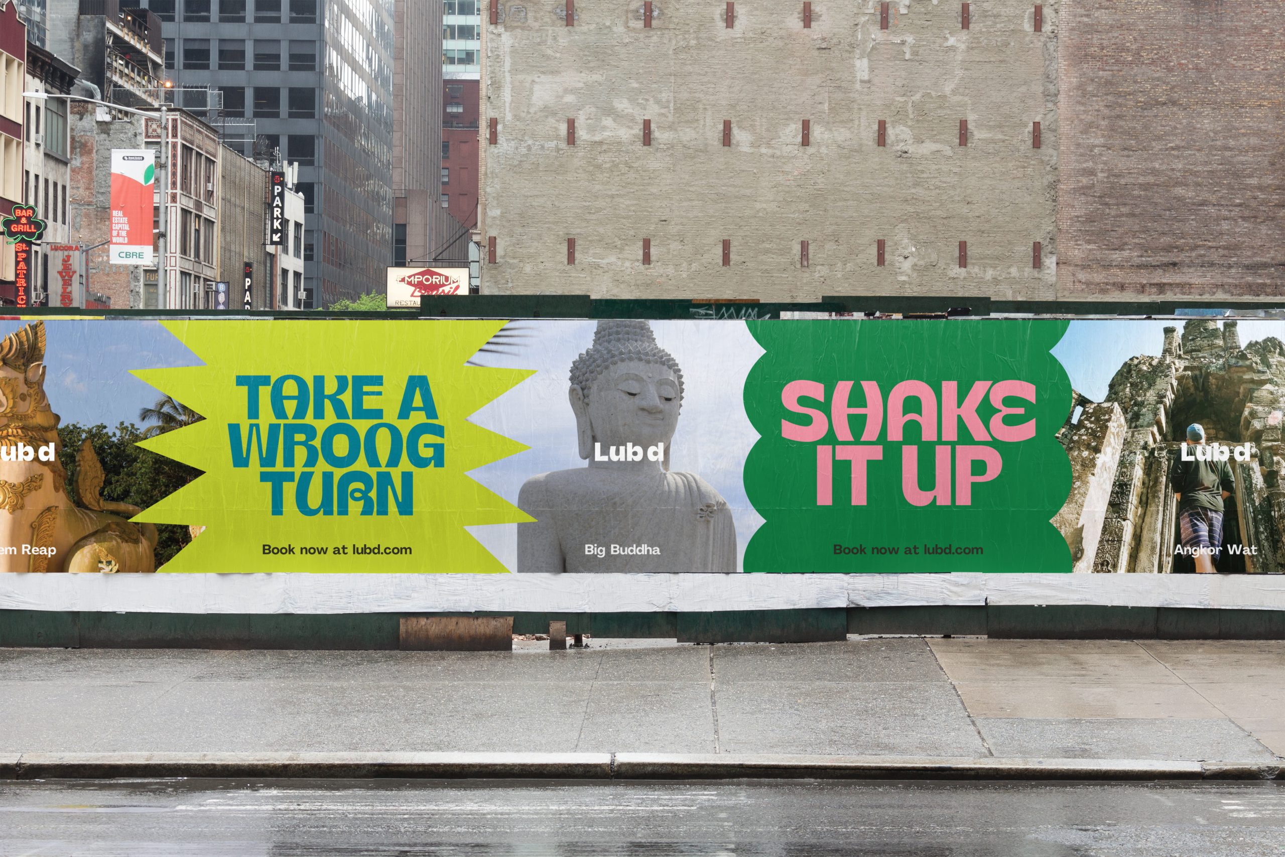
TWO SIDED SHAPE MASK
The two sided shape mask can be used vertically and horizontally. It is for large format & very wide applications, as a divide between different images.
USAGE
- HOARDING
- WEB BANNERS
- INTERIOR MURAL
Divide format into an even number column grid. This will vary depending on the format length
Place the shape masks over your background and content area. Scale to height of the format.
The shape mask overlaps the photography. The typographic content sits contained in the shape mask.
Final layout, in this instance it is possible to replace photography with illustration if required
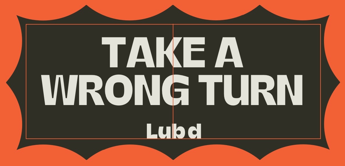
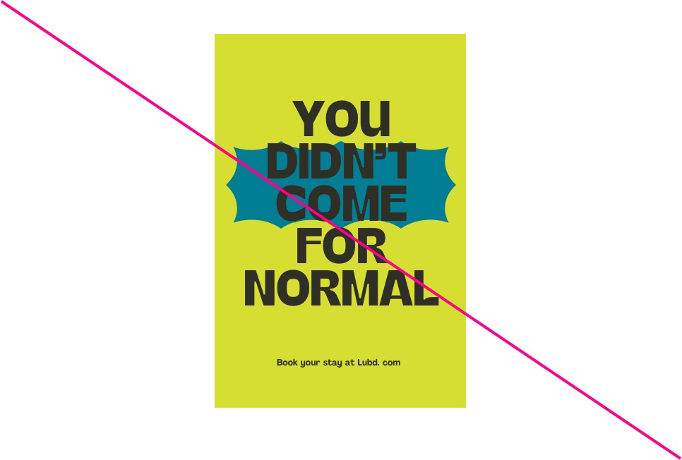
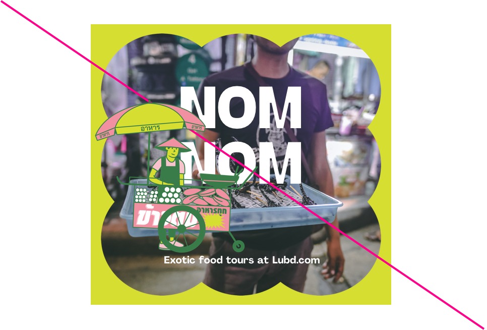
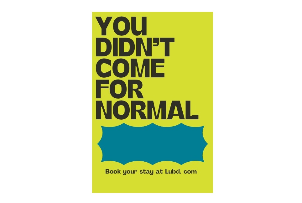
SHAPE CONTAINER –
HEADLINES
The shape container allows photography, typography and illustration to be overlaid. This creates a frame around the content.
USAGE
- EVENT POSTERS
- SOCIAL POSTS
- PORTRAIT BILLBOARDS
- MERCHANDISE
Set the margins tp your format size
Scale the shape to touch the margins on all sides
Use the shape to contain your content
If overlaying type always centre the typography
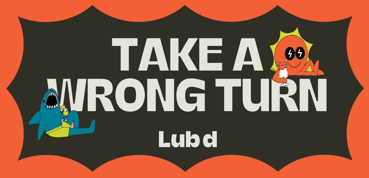
Illustration can be used in the shape container also
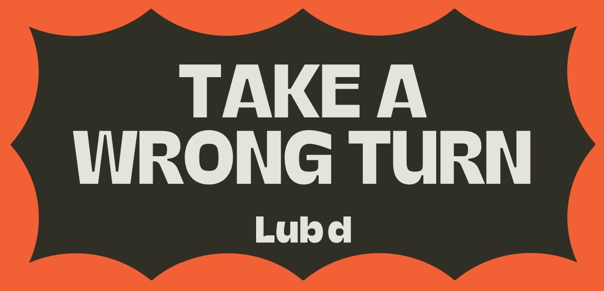
Shape container
The shape mask is primarily for heroing photography. It allows us to own photographic content using our distinct Lub d graphic shapes.
SHAPE CONTAINER –
HEADLINES
Shape container can be used to singularly hero Typography.
USAGE
- BILLBOARD
- MERCHANDISE
- SOCIAL POSTS
Scale the shape to touch the margins on all sides
Create a second margin inside the shape. This should fit neatly centred inside our graphic shape
Place your content centred inside the Content area
Scale the typography to be big and bold creating the final layout
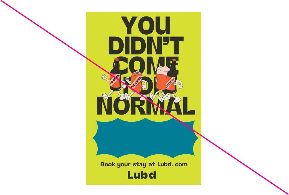
Sticker illustration may be used to accentuate the design.
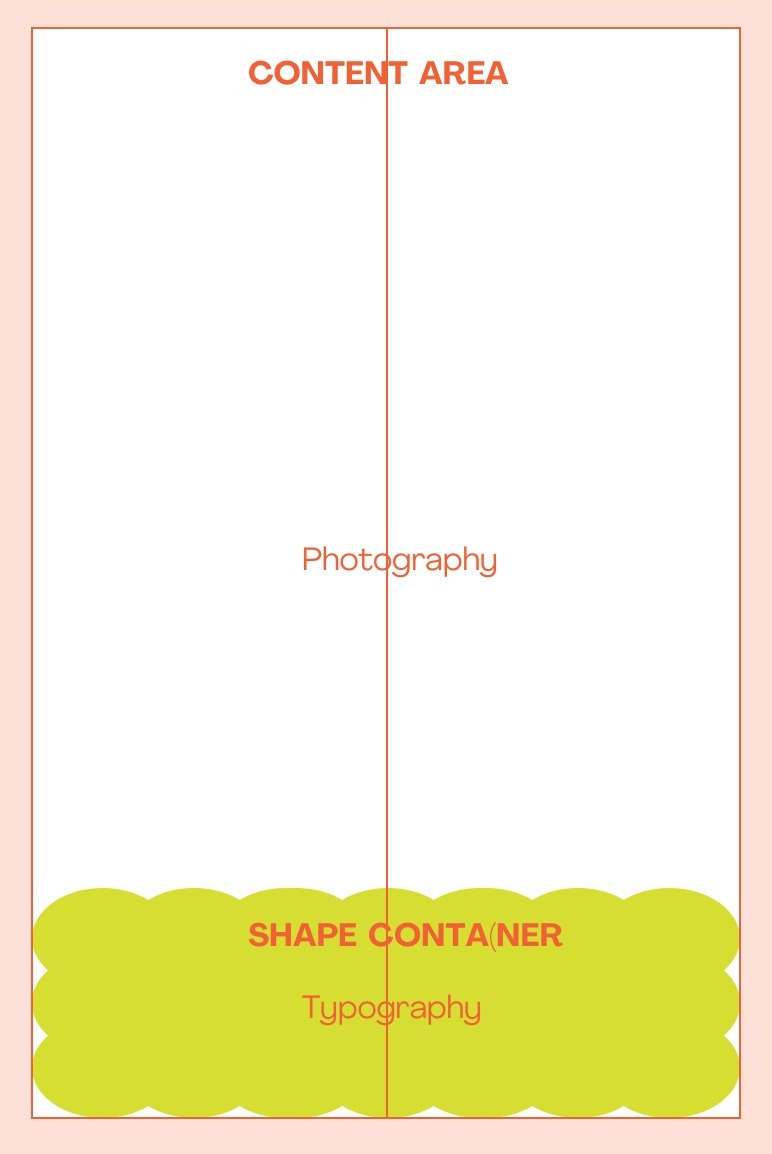
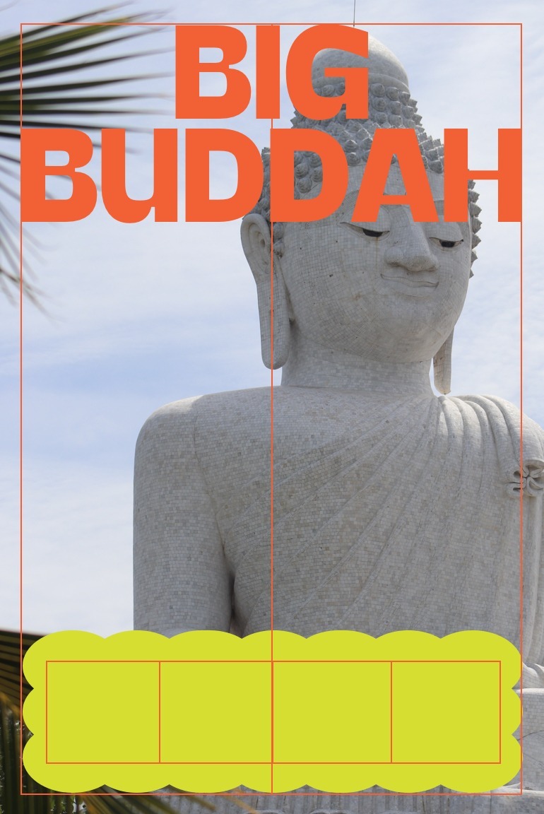
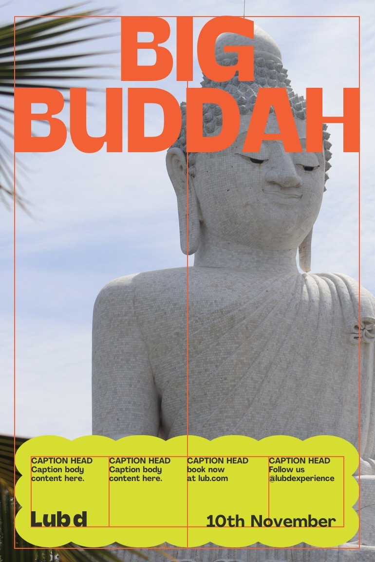
SHAPE CONTAINER –
BODY CONTENT
The shape container can cleanly organise content over photo’s. Best used for event communications.
USAGE
- EVENT POSTERS
- SOCIAL POSTS
Set the margins of your document depending on it’s format.
Scale the shape container to bottom and sides of the margins
Place your photographic content and centred Headline
Create a 4 column grid that fits neatly inside the shape container
Left align all content to your 4 column grid
This layout style is only suitable for photography
Layout in use
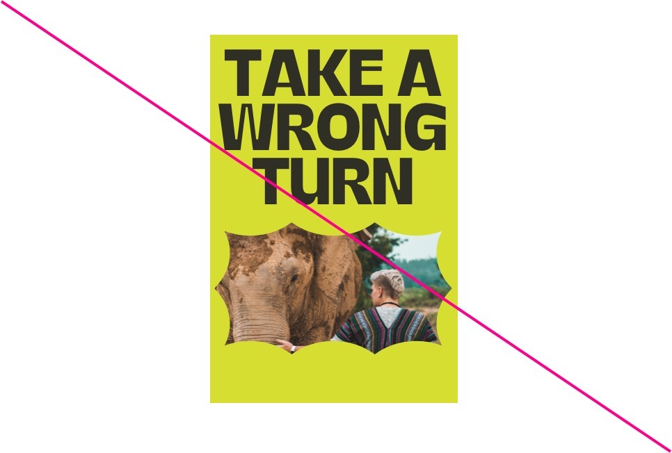
Layout misuse
Here are some things you should never do with our layouts
Do not place type so it overlaps the graphic shapes
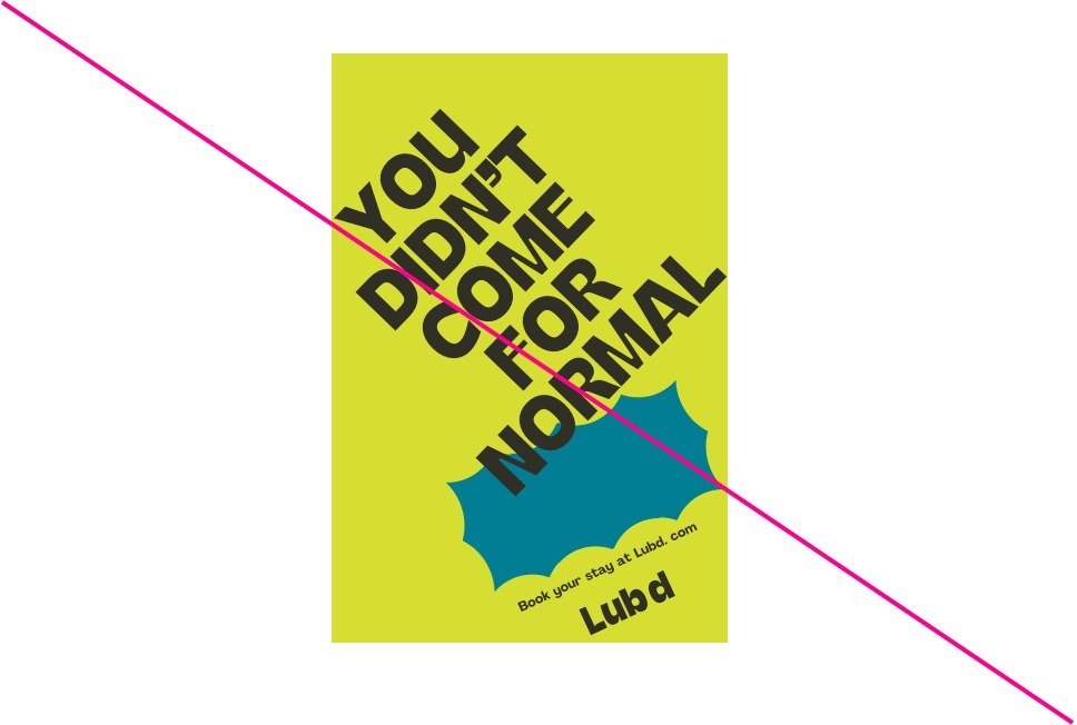
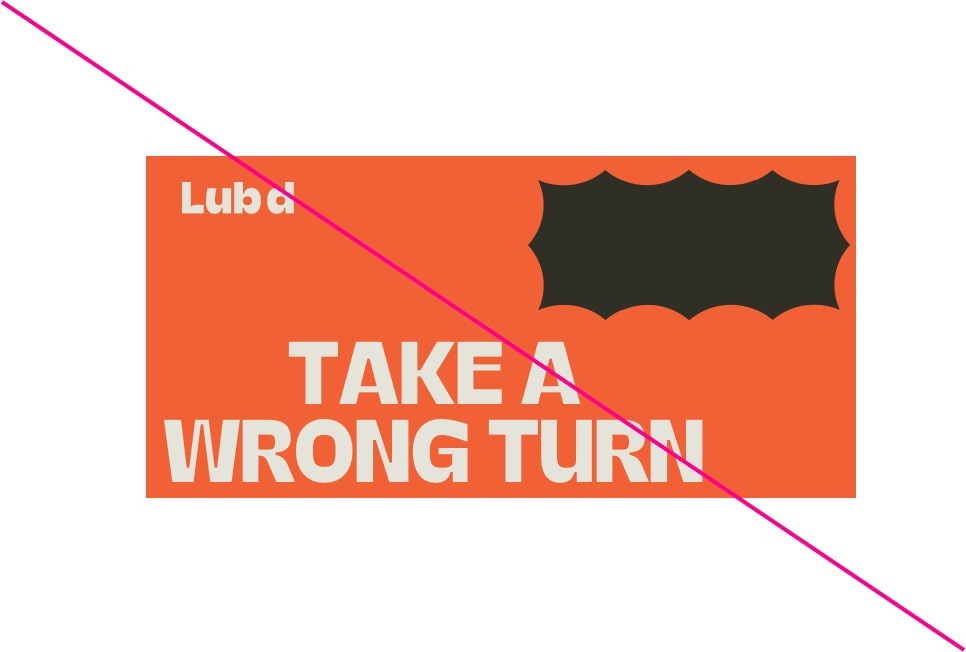
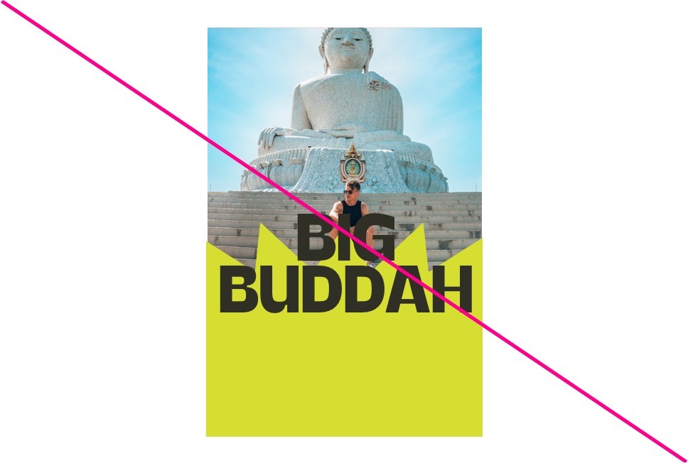
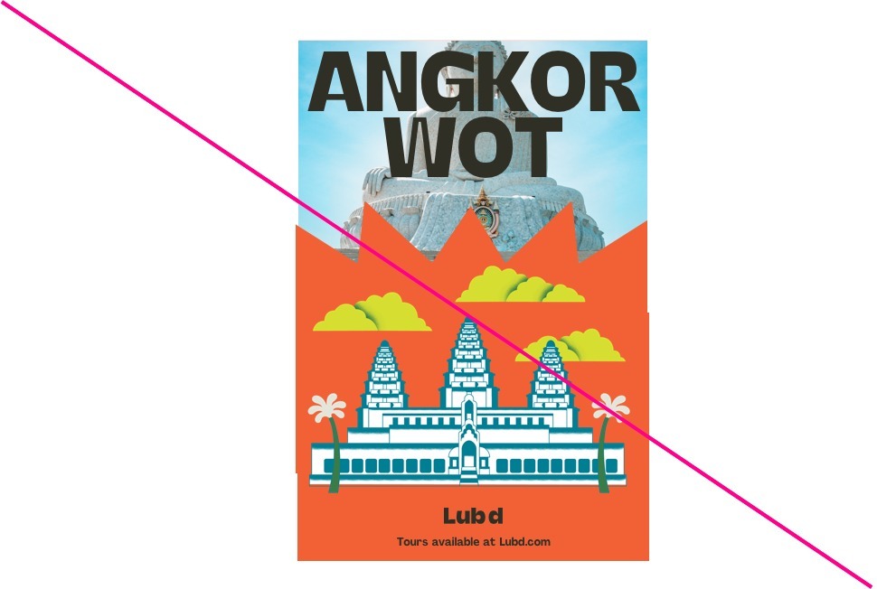
Do not rotate elements or place elements on angles
Do not use illustration with photography in any circumstances
Do not place illustration over typography
Do not left align Headline Typography
Do not separate elements in layouts
Do not allow typography to overlap the edge of the shape mask
Do not combine illustration and photography with the shape mask