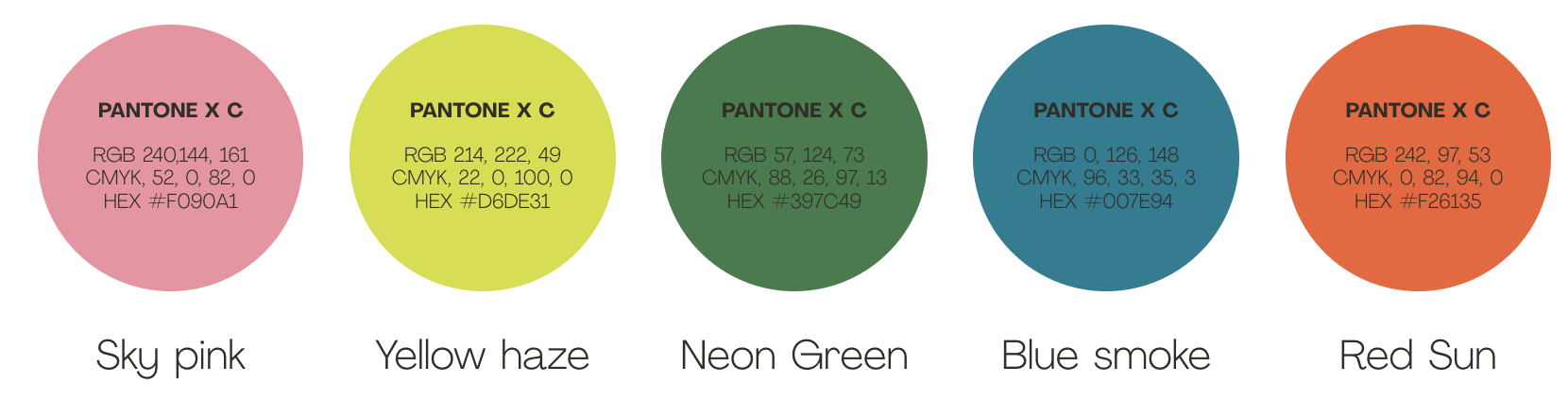
Our brand colours take inspiration from streets of South East Asia. The palette is bold, energetic and grabs attention. We do not have one hero colour in our brand palette, instead we have seven unique colours, each of which bring personality to the palette.
Core Palette
Colours from our core palette should be used across all brand assets and executions.
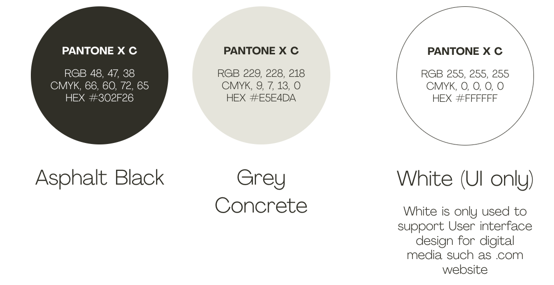
Neutral Palette
Our neutral palette is secondary, and so colours from this palette are only used to support the core colours where required, such as UI.
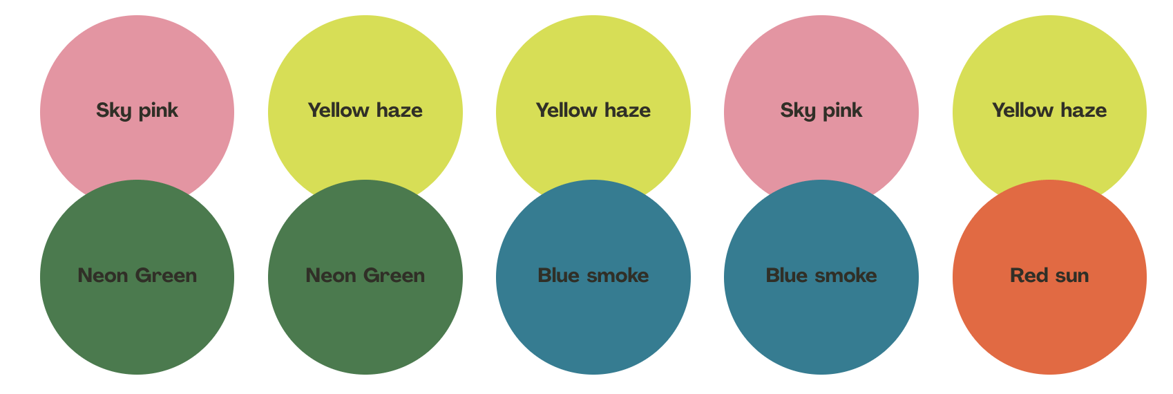
Colour Combinations
We only use specific combinations of colour in our brand. See below for guidance on which combinations to use.
Colour Use
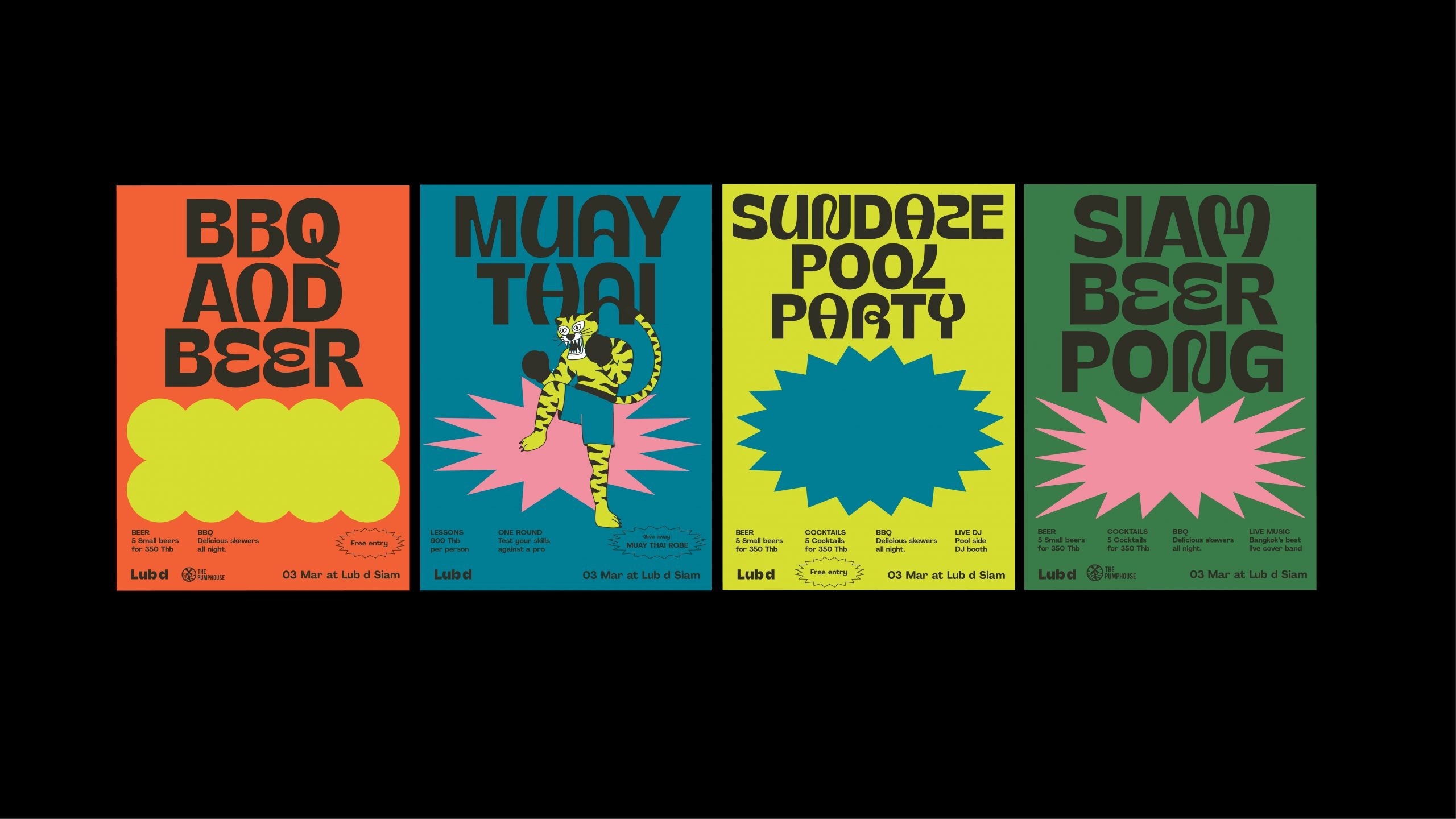
In order to maximise the visual impact of our palette, the colours should be used specific ways to ensure executions don’t become too busy. We should either use one or two core colours, which can be supported by another colour from the neutral palette.
NEUTRAL & ONE COLOUR
When using a single core colour only, it should be used as the background colour. A neutral colour may be used for typography and messaging.
TWO COLOUR
We can use core colours for both the background and the typography, only if we are not using our brand shapes in the execution.
NEUTRAL & TWO COLOUR
When using our brand shapes, we should a core colour for the shape and another core colour for the background. We reserve the neutral colour for typography.
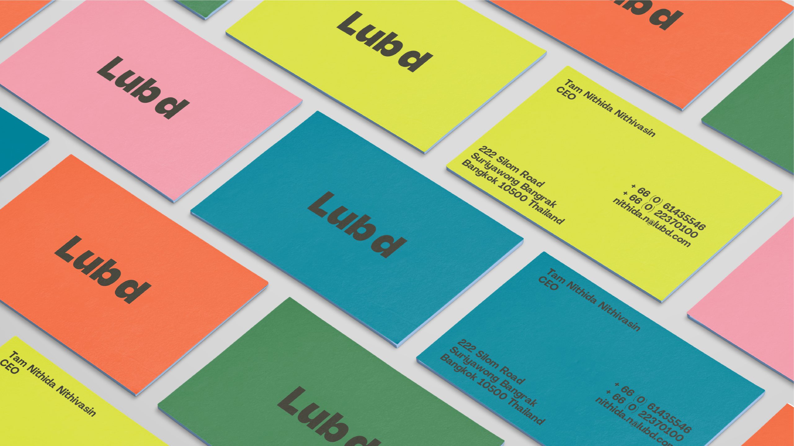
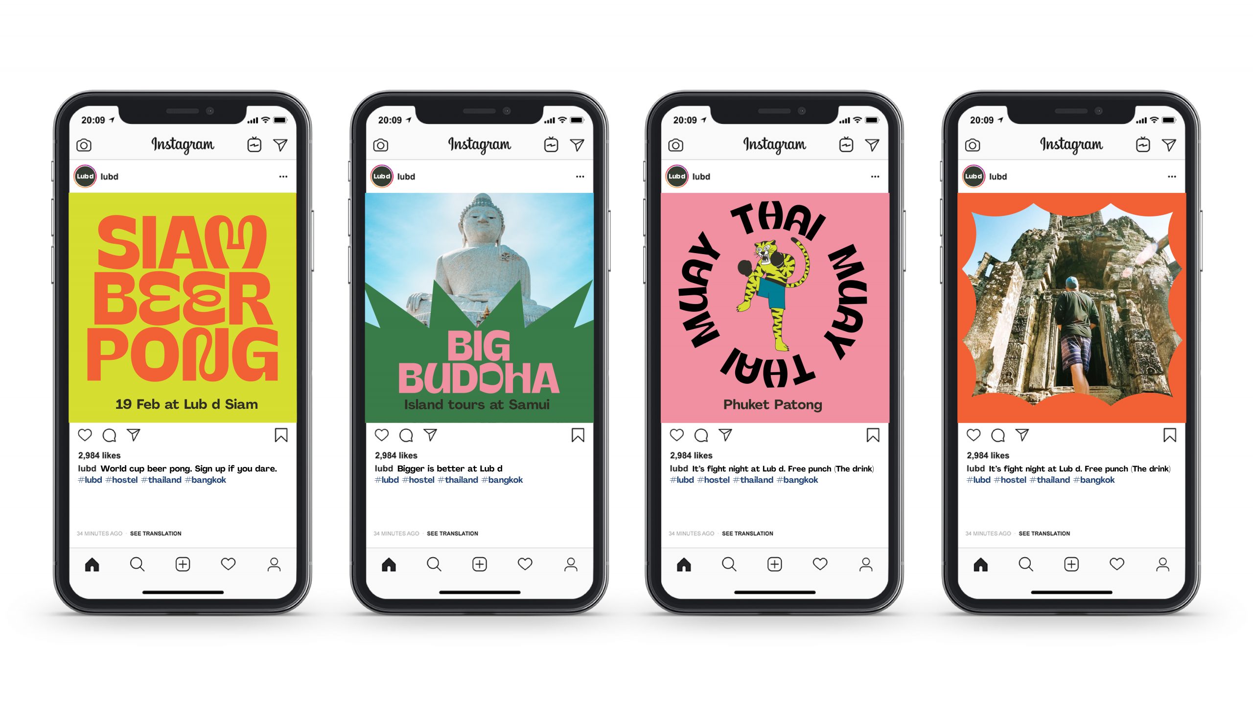
Colour In Use
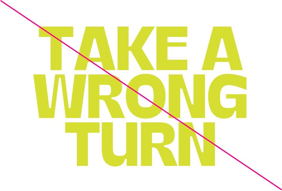
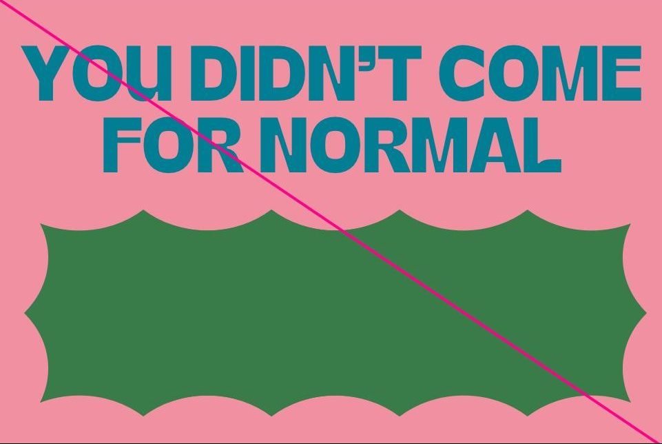
Colour Misuse
Below are some examples of how you should not use colour.
Do not put light colours on white or grey
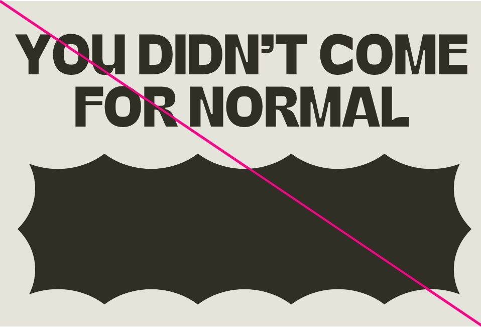
Do not use more than two core colours at one time
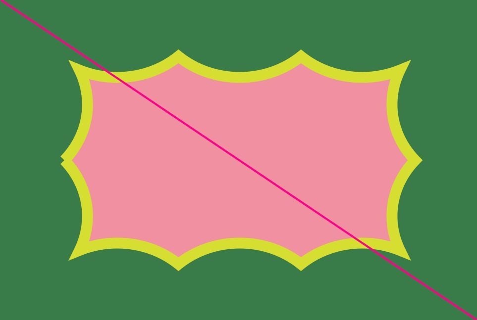
Do not create new colours
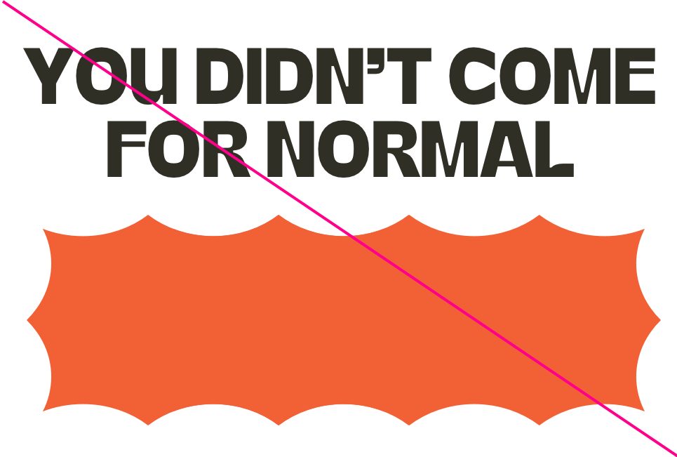
Do not use white as a background colour
Do not use white for shape or type colours
Do not use colours as borders
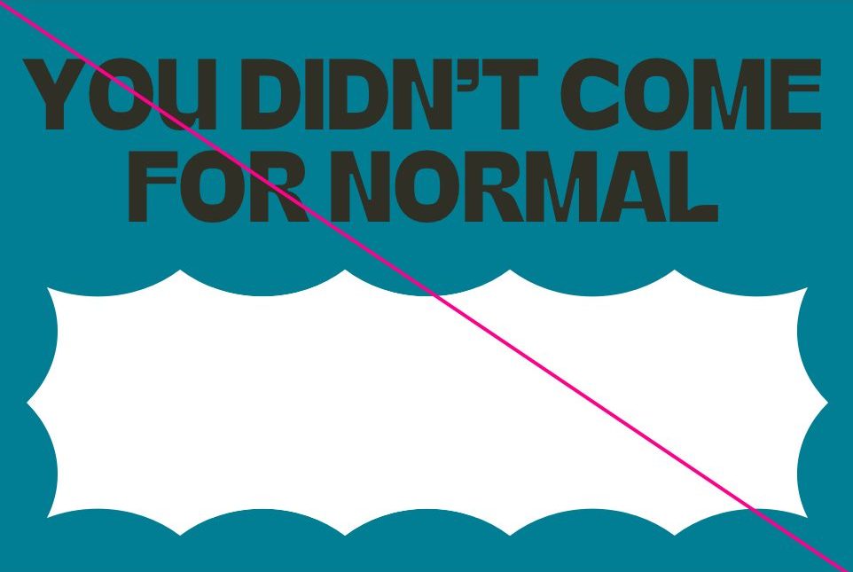
Do not use only neutral colours
Do not deviate from the prescribed colour combinations