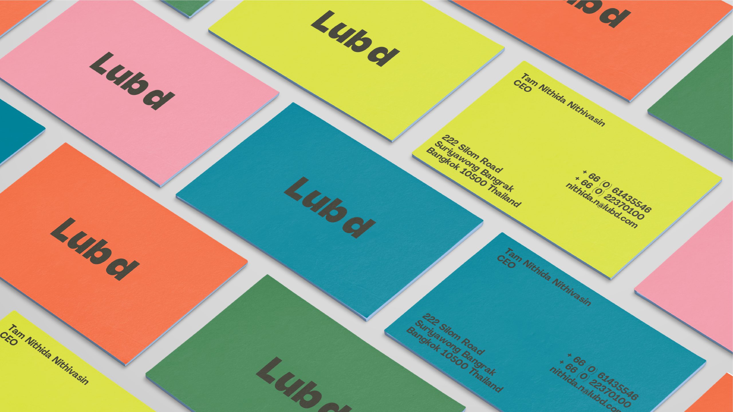
Our logo is bold and clear with a hint of Lub d personality.
Logo On Colour
Our logo is confident and bold. We can use our logo in black or white, or in our brand colours on coloured backgrounds.
Not all colour combinations should be used for the logo. See our guide below for best practice use of colour pairings.
Logo On Photography
We want to make sure our logo is always legible. When using the logo on photography, choose a colour which ensures the greatest possible clarity and contrast.
Clear Space
To ensure our logo remains clear and visible we recommend observing a clear space around it in all applications.
Partnership lock-up
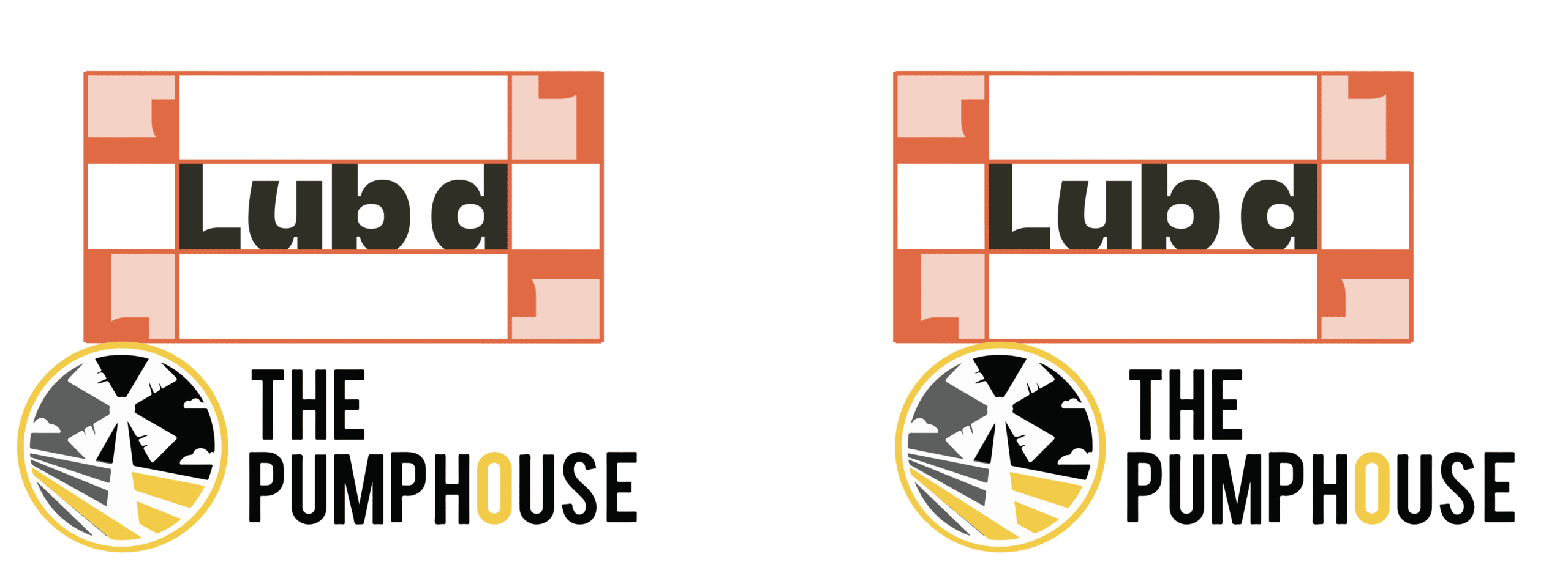
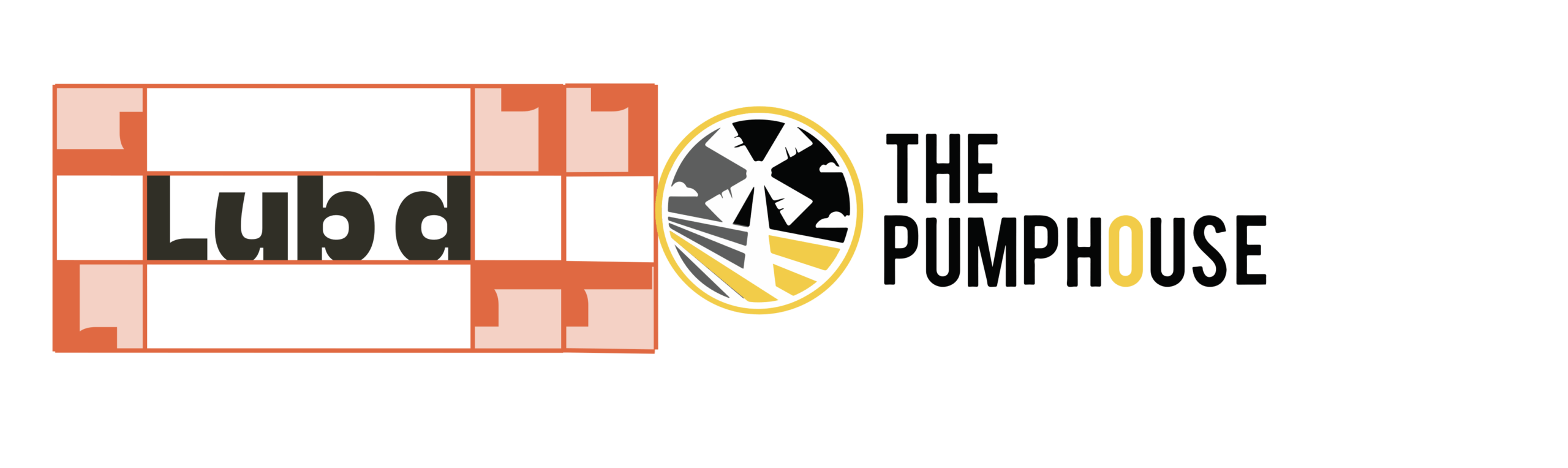
When placing the Lub d logo next to a partner logo always ensure to use the logo clearspace. Partner logos can be stacked horizontally or vertically.
VERTICAL LOCK-UP
Use the Lub d logo clearspace to set the visual separation between the logo’s. Logo lock-ups can be set flush left or centred under the Lubd logo. Ensure both logos are proportionally similar size.
HORIZONTAL LOCK-UP
Horizontal logo’s use double the logo clearspace as vertical lock-Ups. Ensure both logos are proportionally similar size.
Logo Placement
We want our logo to look its best in every application we produce. For this reason, the are multiple different places our logo can be placed within a layout. This flexibility ensures clarity and stand out for all executions. Follow the below guide and choose the right logo placement for the layout you are producing.
Logo Lockups
When placing the Lub d logo next to a partner logo always ensure to use the logo clearspace. Partner logos can be stacked horizontally or vertically.The diagrams below show best practice placement for our logo across common application formats.
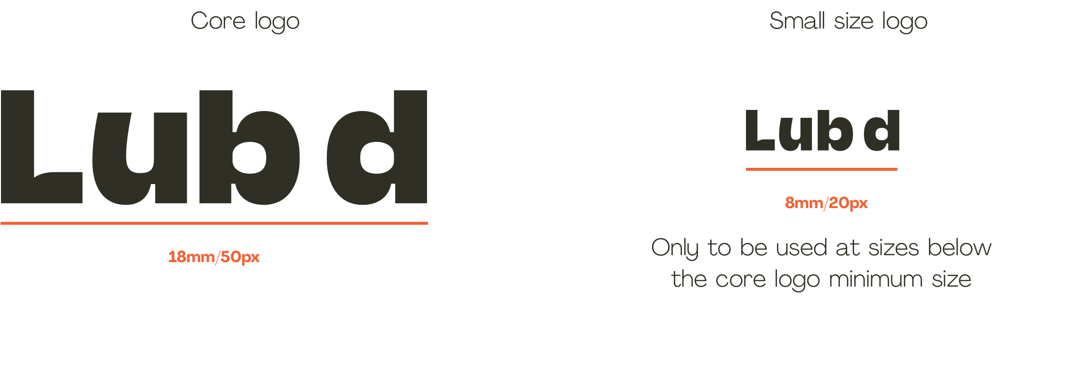
Minimum Size
We want our logo to look its best in every application we produce. For this reason, the are multiple different places our logo can be placed within a layout. This flexibility ensures clarity and stand out for all executions. Follow the below guide and choose the right logo placement for the layout you are producing.
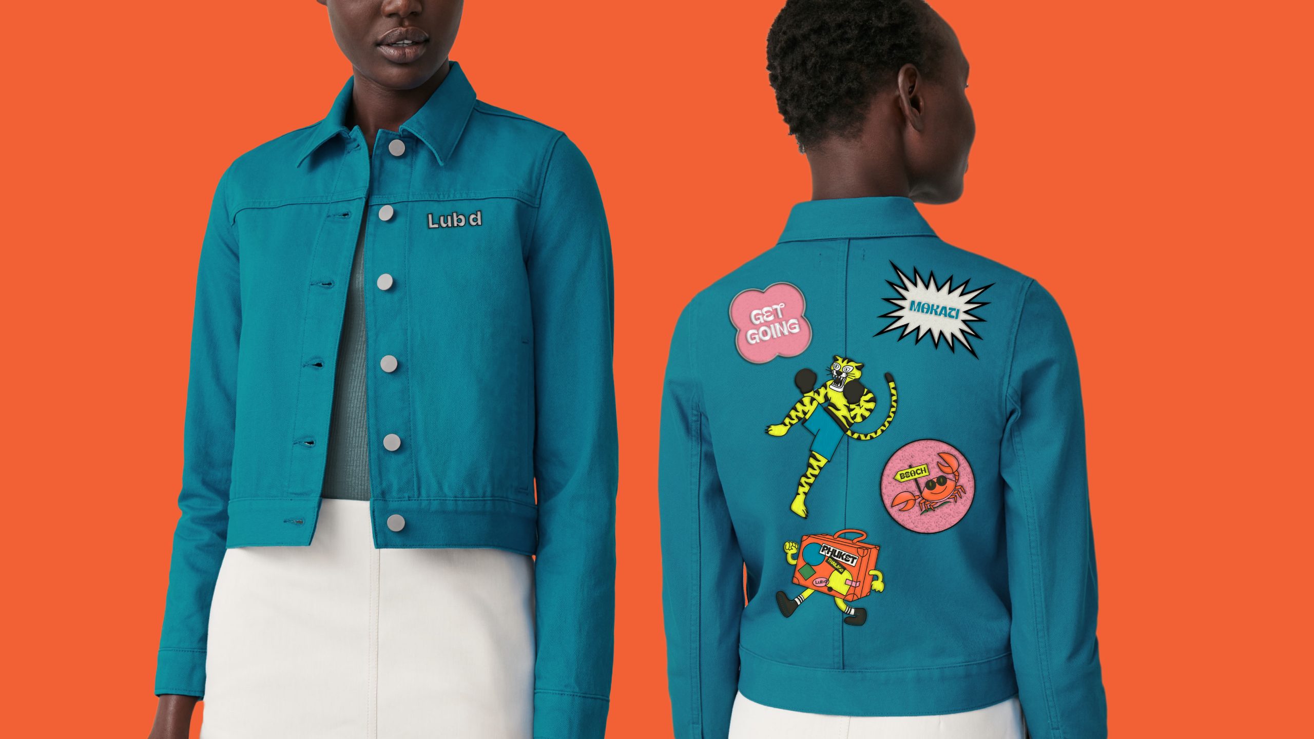
Logo In Use
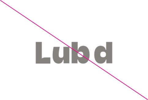
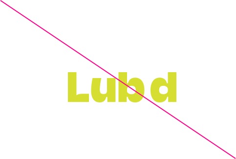
Logo Misuse
Below are some examples of how you should not use the logo.
Do not stretch or distort the logo
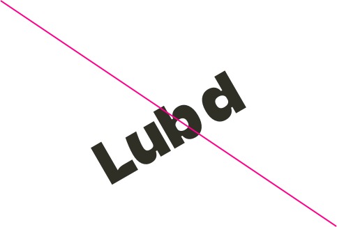
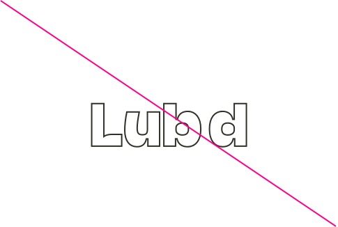
Do not rotate or place the logo on an angle
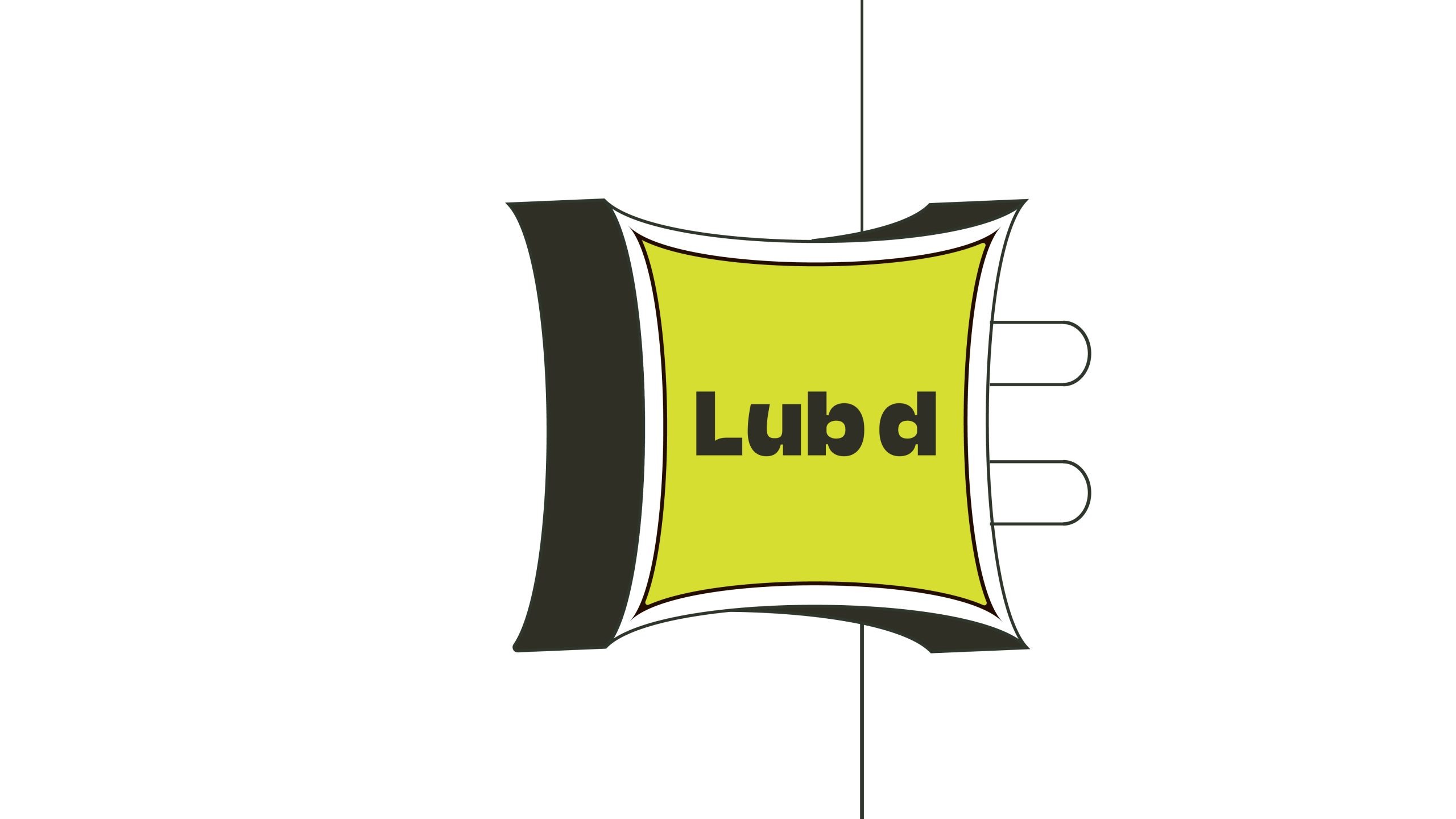
Do not place the logo on multiple elements
Do not outline the logo
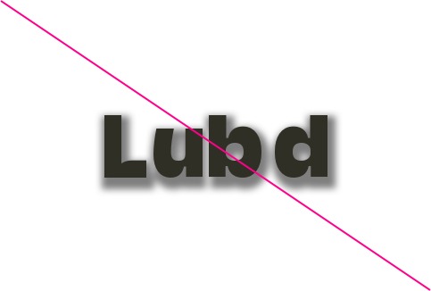
Do not use shadows or effects on the logo
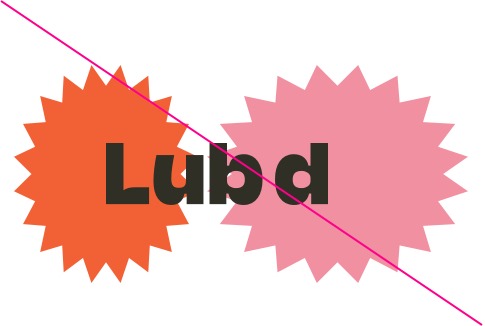
Do not combine colour-ways that are not specified in the logo colour use section
Do not tint the logo or lower the opacity
Do not adjust the spacing of the logo
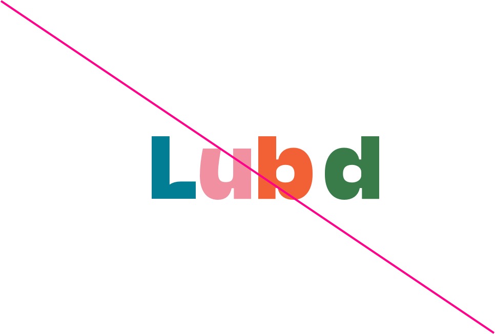
Do not use the logo in colours that are not provided in the logo asset file