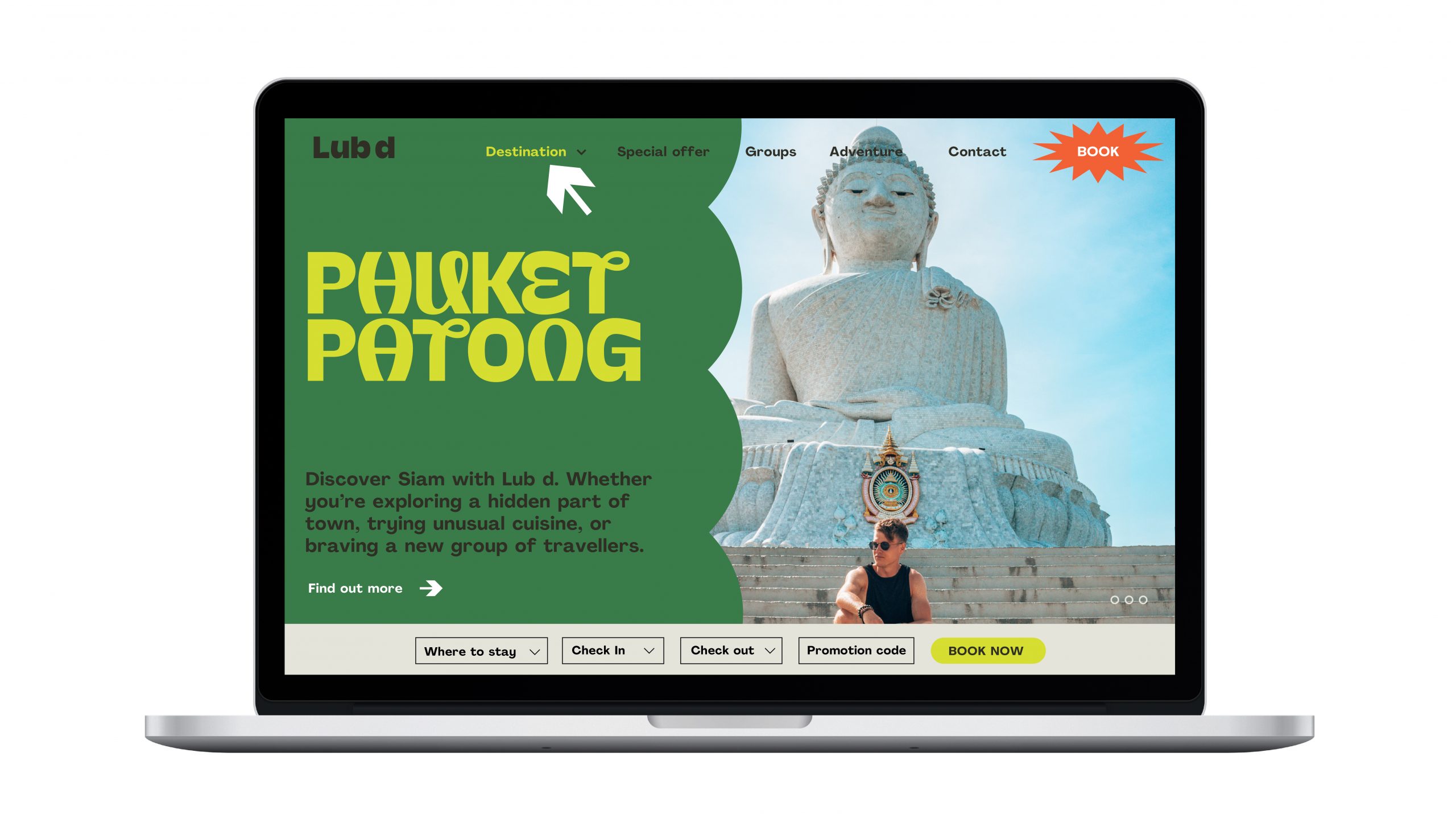
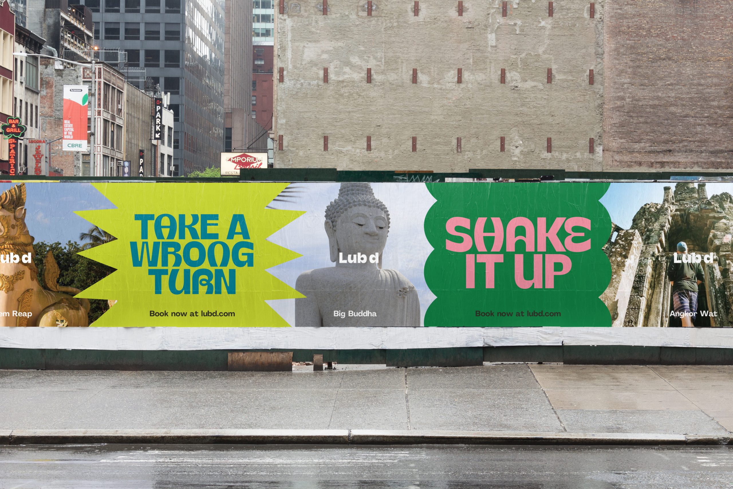
Typography is the hero element of the Lub d brand. We use our bold and distinct headline typeface confidently across all communications, giving personality to our messaging.
Our Typeface
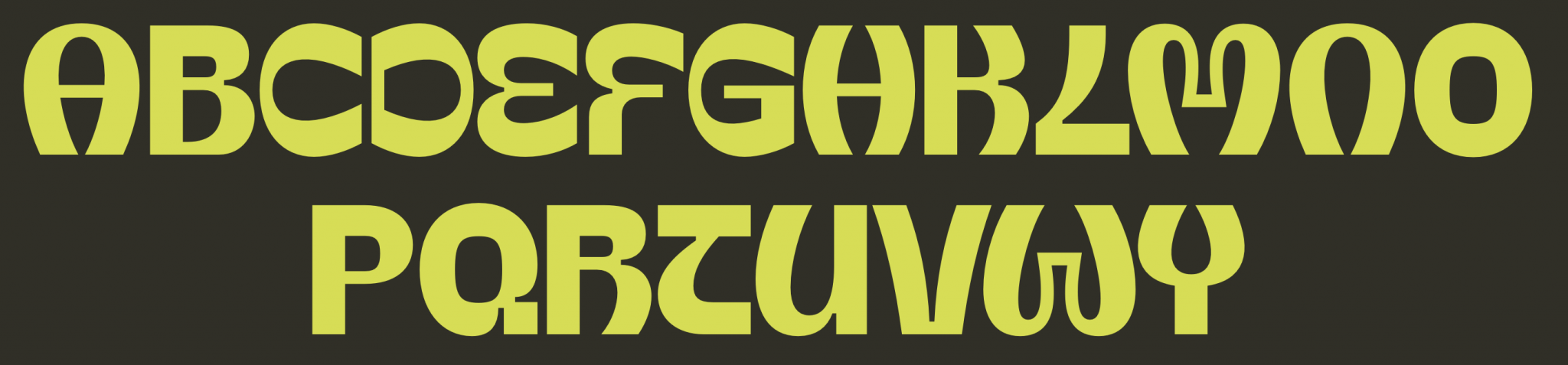
The typeface is called Pad Type in reference to the Thai dish combining sweet, sour, salty, and spicy elements. It is created with a combination of unique and expressive letterforms, which take reference from the diverse experiences we want our customers to have when they stay at a Lub d.
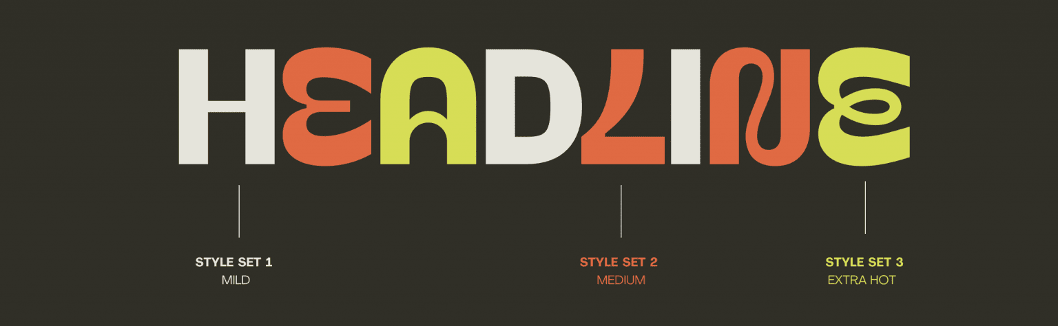
STYLE SET 1
STYLE SET 2
STYLE SET 3
Combining Style Sets
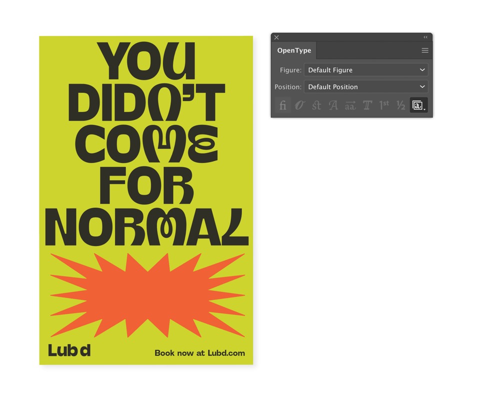
All the headlines are a combination of the three style sets. We never use one style by itself.
Applying Style Set Feature
Our typeface automatically cycles through the style sets as you set the type. This is coded into the Pad Type font.
See instructions below on how to activate this feature.
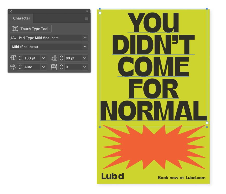
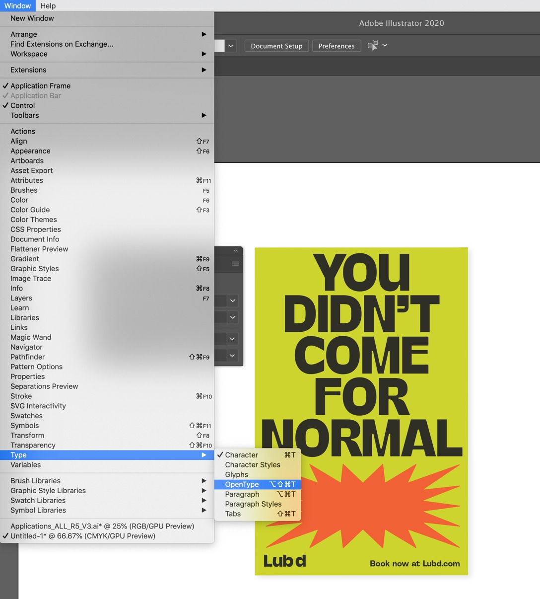
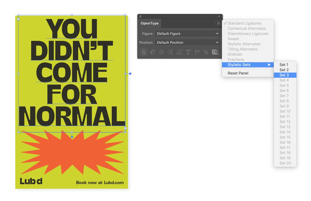
TYPE STYLE SET FEATURE
This diagram shows how to activate the type style set feature in Adobe Illustrator 2020.
This diagram shows how to activate the type style set feature in Adobe Illustrator 2020.
Go the menu at the top of the screen and select the window tab. Follow the guidance in the diagram. Window > Type > Opentype
From the Opentype menu tab select the burger menu icon and set the style to style set 3. Menu icon > Style Sets > Set 3
The type will now have alternate character sets in the fonts
STYLE SET TUTORIAL
Watch this video for a step by step guide on setting your style set.
Secondary Typeface
For body copy, subheads and all other functional copy we have a secondary typeface. Agrandir is bold, simple and legible. We use our secondary font in two different weights depending on application.
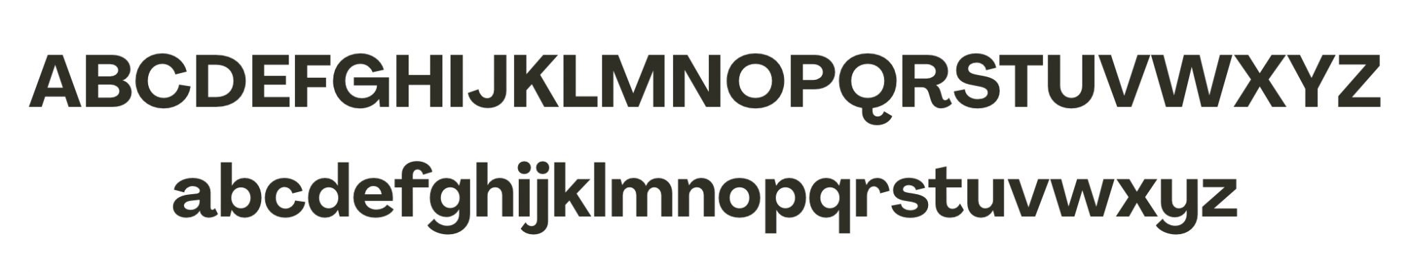
AGRANDIR BOLD
Agrandir bold is used for subheads, website urls and captions.
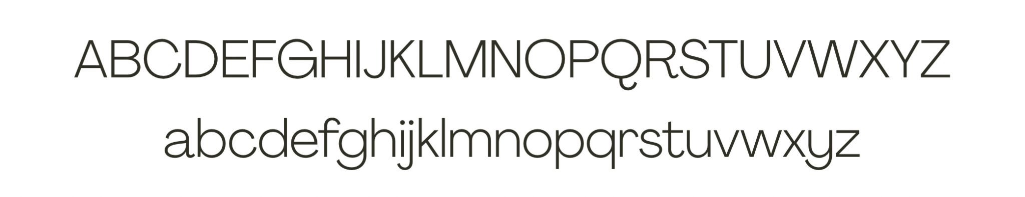
AGRANDIR REGULAR
Agrandir regular is used for large pieces of text such as body copy.
Setting Type Styles
Be sure to follow the guidance below to create type consistency across all applications.
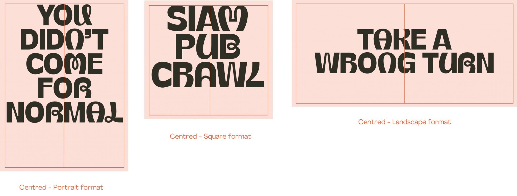
HEADLINES
Headlines are always centred in the middle of the application.
PAD TYPE
Centre alignment
All caps
Leading – 80%
Tracking – 0
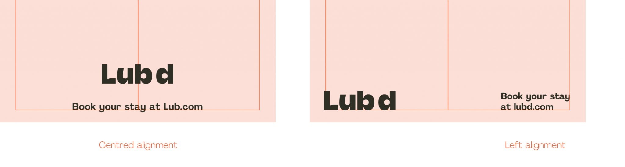
SUB HEADERS / URL
Sub headers can be left aligned or centred.
AGRANDIR BOLD
Weight – bold
Left or centre alignment Sentence case
Leading – 120%
Tracking – 0
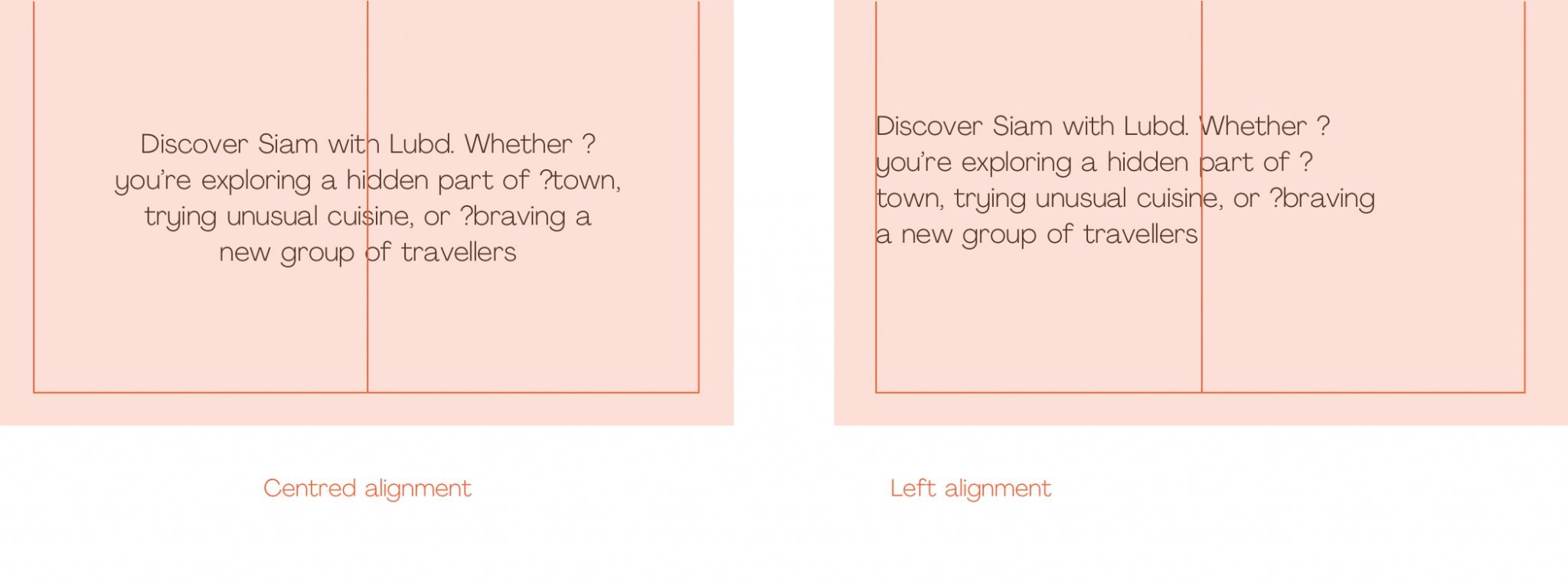
BODY COPY
Body copy can be left aligned or centred.
AGRANDIR REGULAR
Weight – regular
Left or Centre alignment Sentence case
Leading – 120%
Tracking – 0
BODY COPY
Body copy can be left aligned or centred.
AGRANDIR REGULAR
Weight – regular
Left or Centre alignment Sentence case
Leading – 120%
Tracking – 0
Type Hierarchy
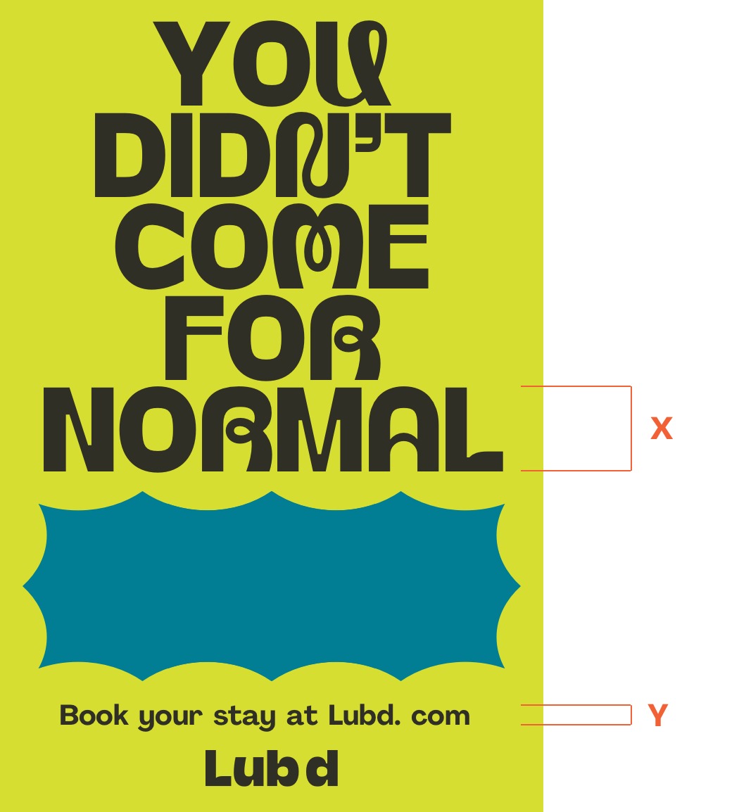
It is important to have a hierarchy in each layout, to establish an order of importance.
As a rule, there should be a numeric relationship between type sizes. This relationship is illustrated below.
HEIRARCHY
Our subheads are approximately 20 – 25% the size of our headlines
Headline = X
Example – 80 pt size
Subhead = Y
20 – 25% of X pt size
Example – 20 pt size
Thai and Khmer usage
Thai and Khmer fonts have been provided for instances when the latin alphabet is not suitable. Where appropriate these fonts should follow the same styling as our main headline font.
Thai
Headlines should be centre aligned in all instances. Body copy can be left aligned or centred.
Headline
Weight – Bold
Centre alignment
All caps
Leading – 80%
Body
Weight – Regular
Centre aligned / Left aligned
Sentence case
Leading – 120%
KHMER
Headlines should be centre aligned in all instances. Body copy can be left aligned or centred.
Headline – KST Cic KhmerFr1
Weight – Bold
Centre alignment
All caps
Leading – 80%
Body – KST Aksardai New
Weight – Regular
Centre aligned / Left aligned
Sentence case
Leading – 120%
Typography In Use
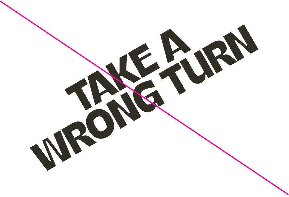
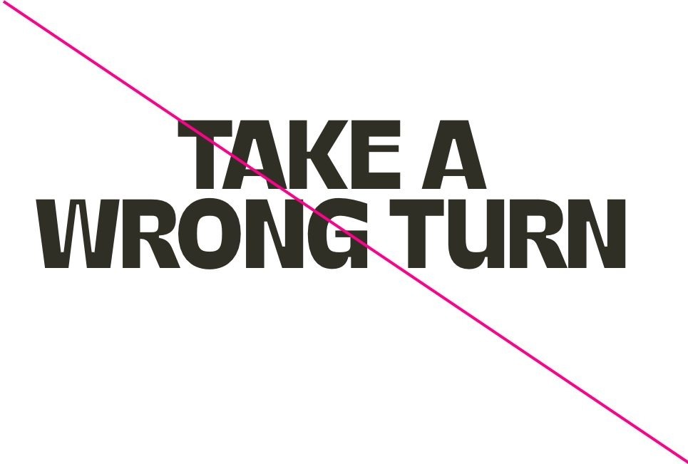
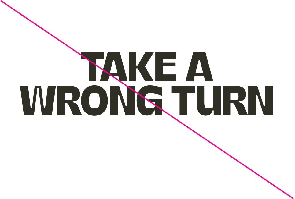
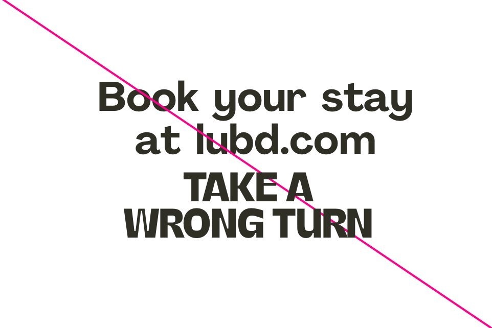
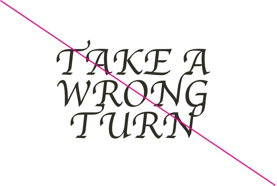
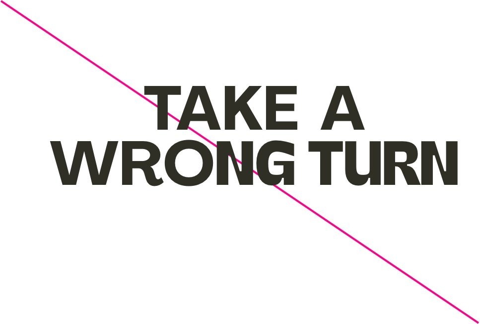
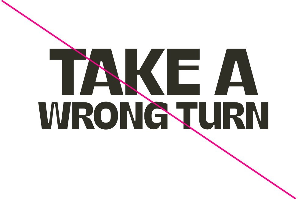
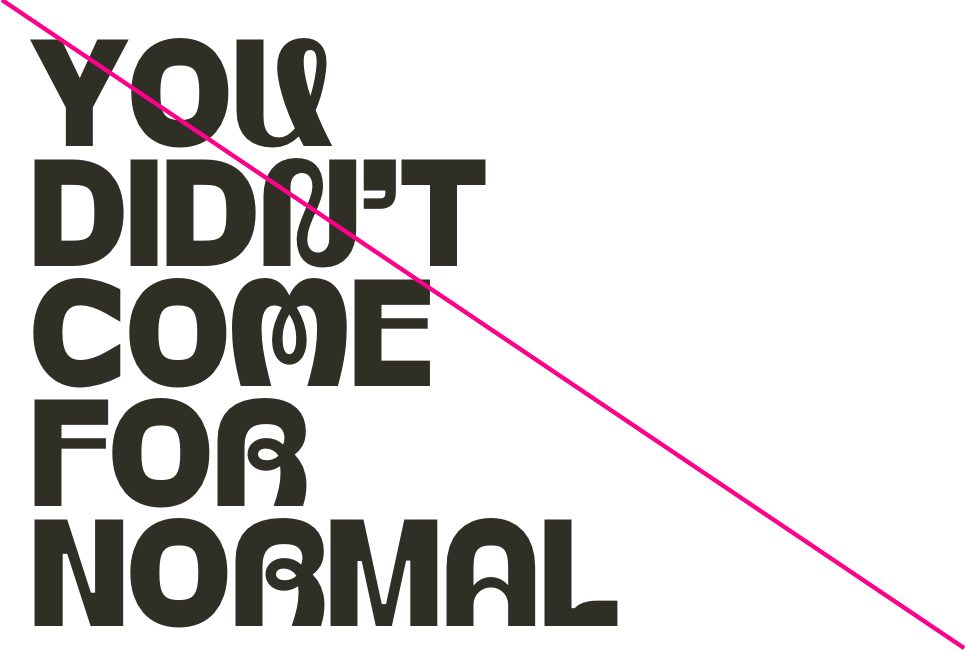
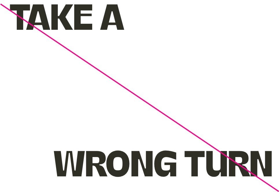
Shape Misuse
Below are some examples of how you should not use the shapes.
Do not set type on angles
Do not set headlines without using alternates
Do not make every letter an alternate
Do not set the secondary type face larger than the headline type face